The Challenge
Car Throttle, a leading online automotive community with millions of users, faced growing demand for a native mobile app. Users desired a more convenient way to access content, receive notifications, and engage with the platform.
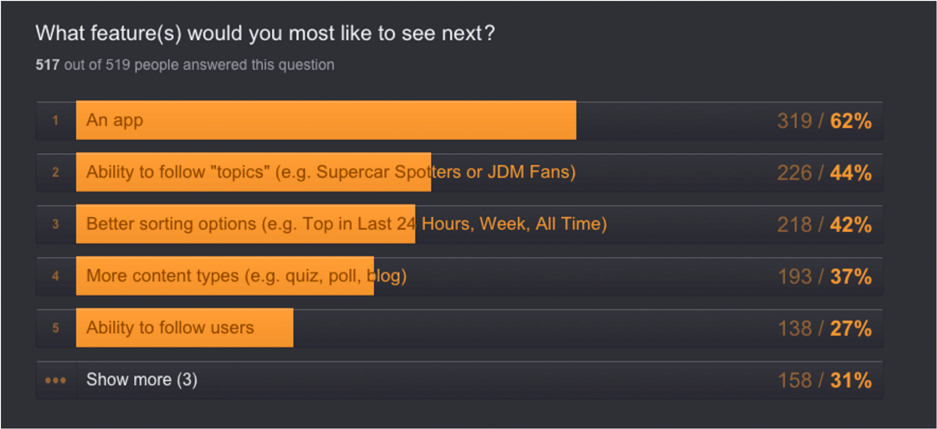
Survey results from the community showing the desire for an app
The Solution
To meet this demand, I designed and launched native apps for both iOS and Android platforms. The apps provided:
– Quick access to the Car Throttle feed
– Native notifications for likes, comments, and follows
– Native content-sharing capabilities
– An optimized content consumption experience
The Outcome
The Car Throttle app was a success, achieving:
– Over 200,000 downloads
– Over 25,000 app reviews
– 4.9/5.0 Play Store rating
– Hundreds of user posts per day

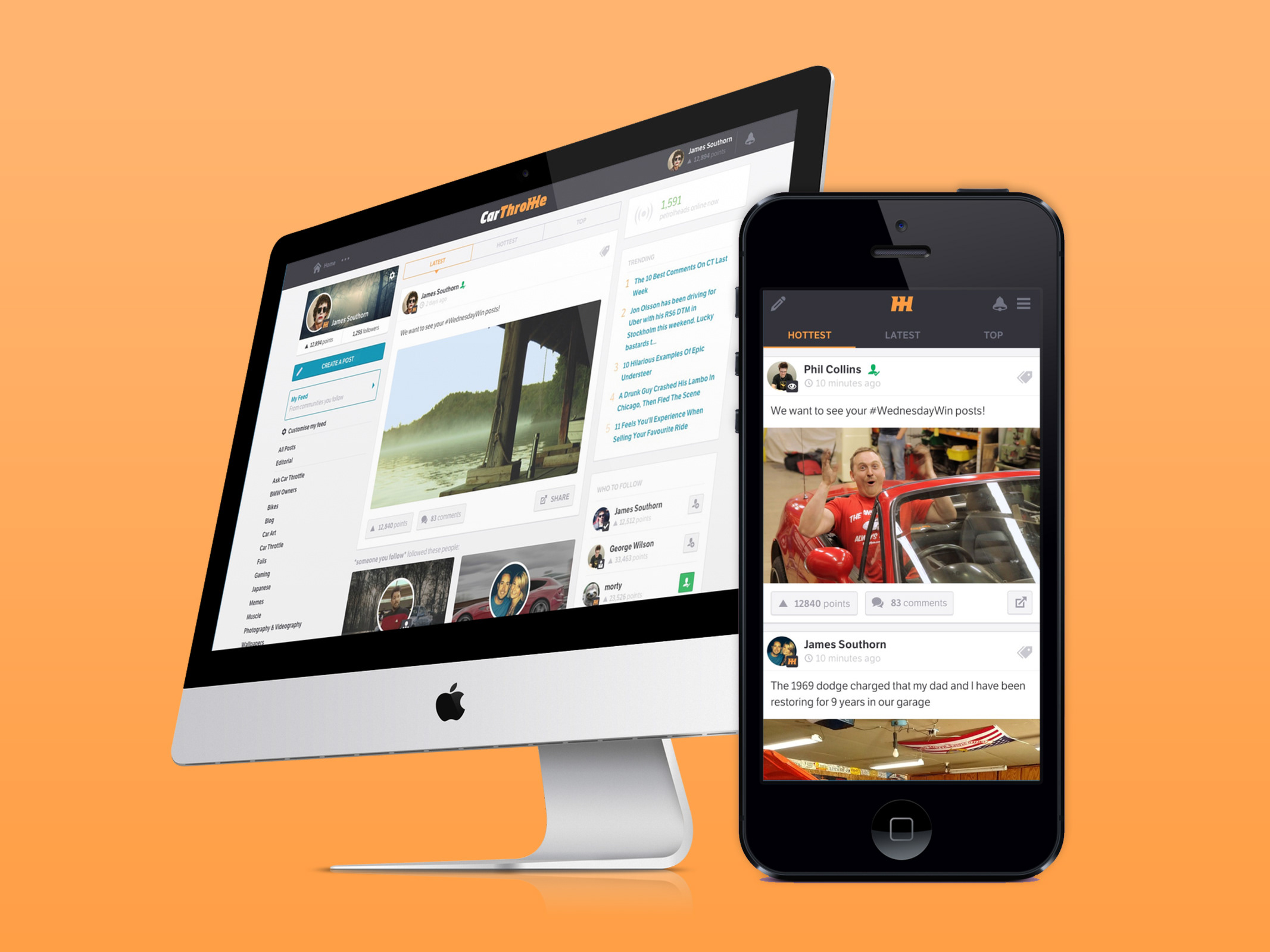
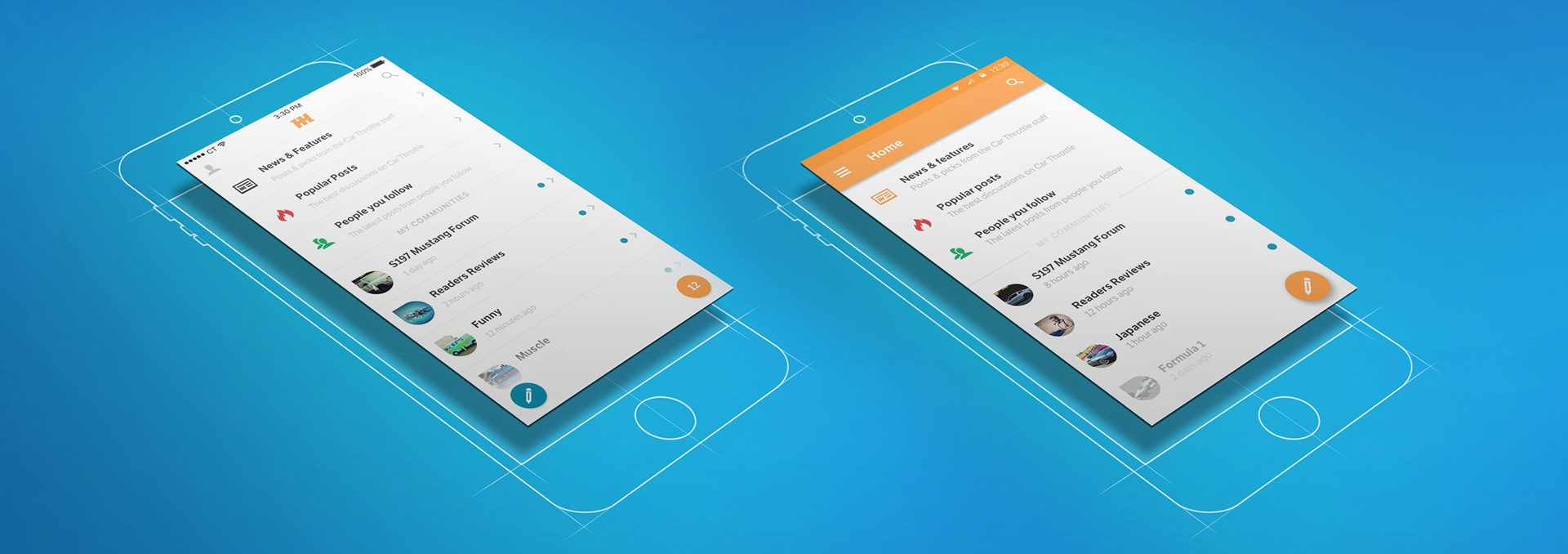
The Car Throttle Android and iOS app
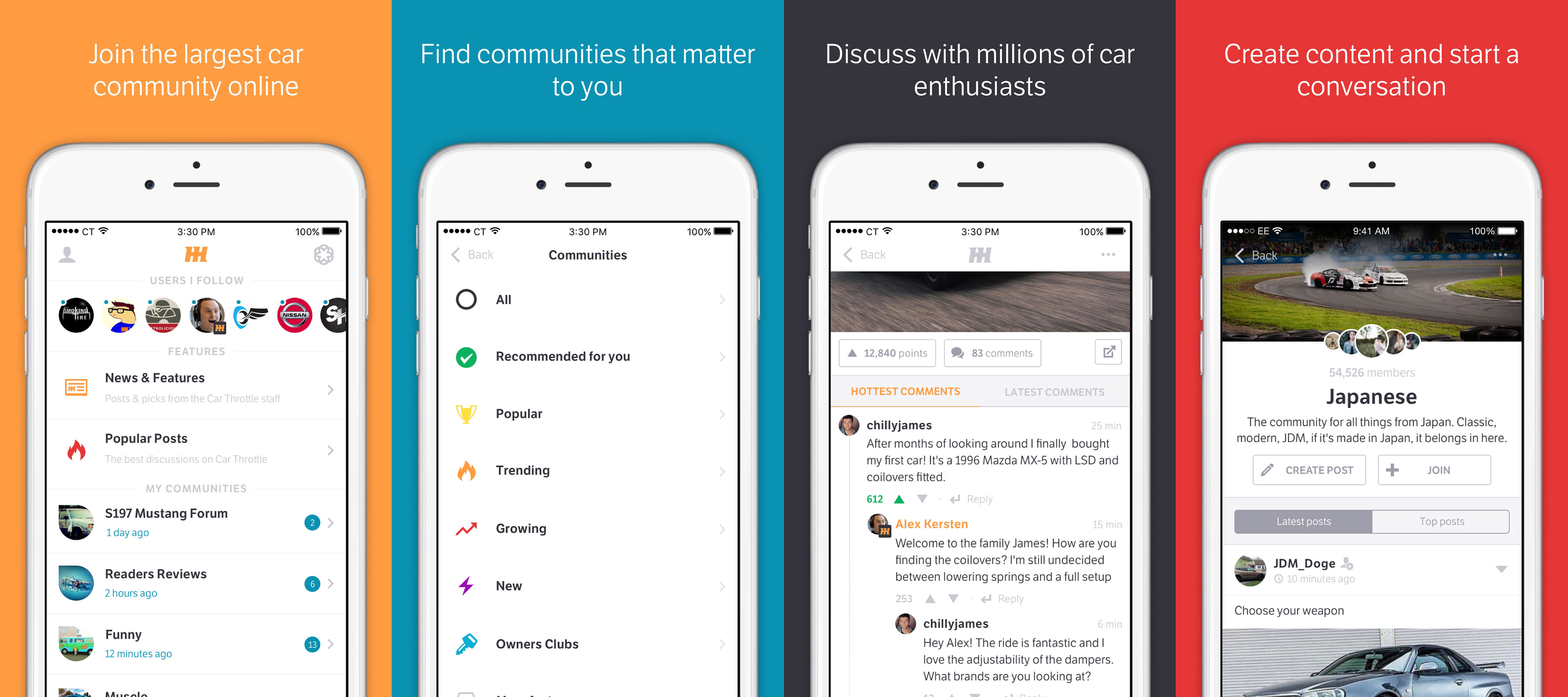
iOS app store screenshots of the main features
Mind map

Brainstorming communities and the features of the platform
User flow
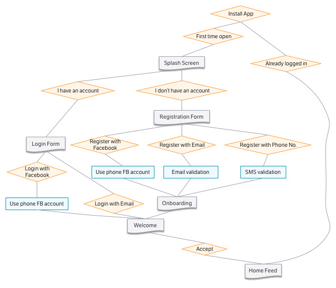
Registration flow chart
Sketches
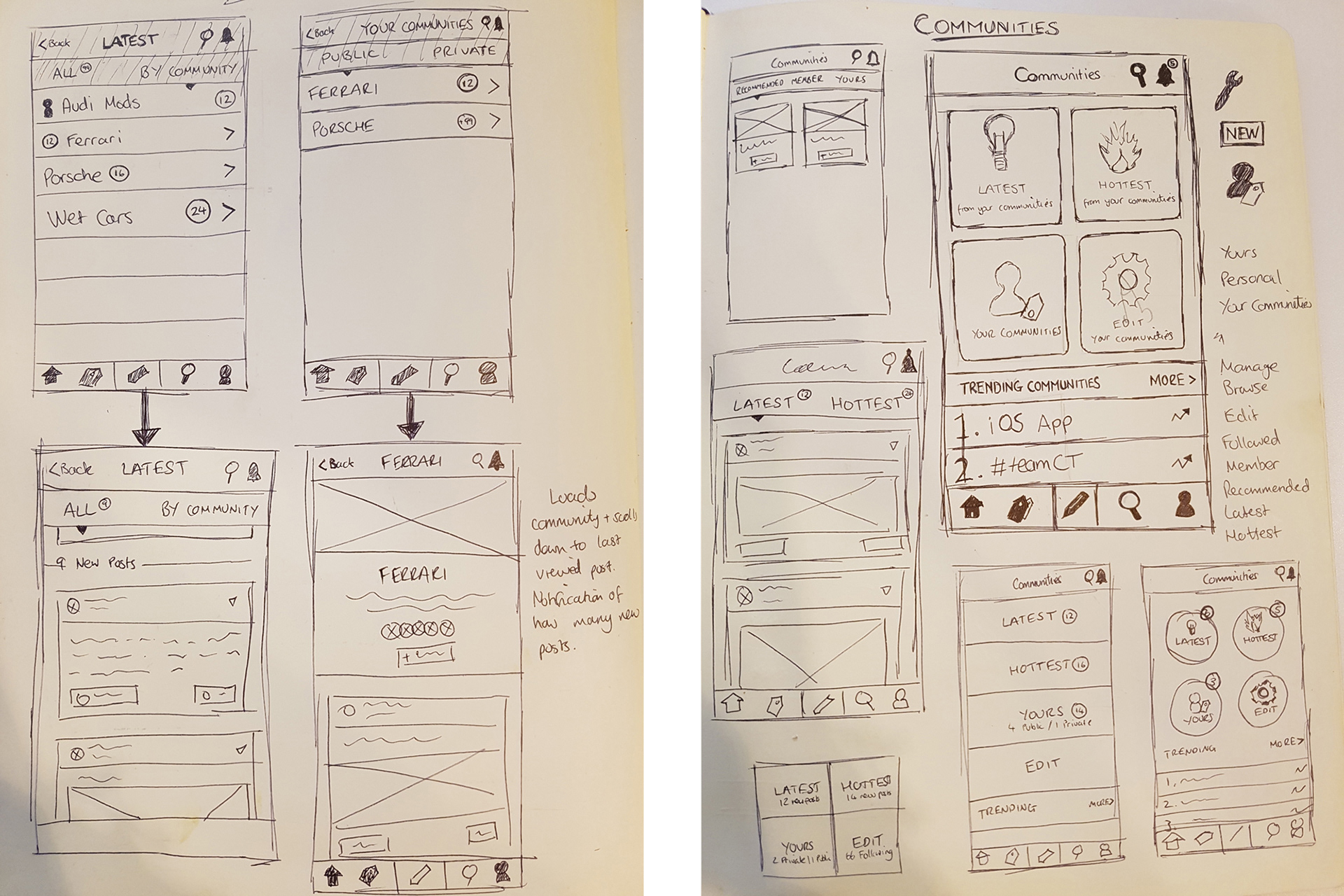
Wireframes for the 'communities' home screen
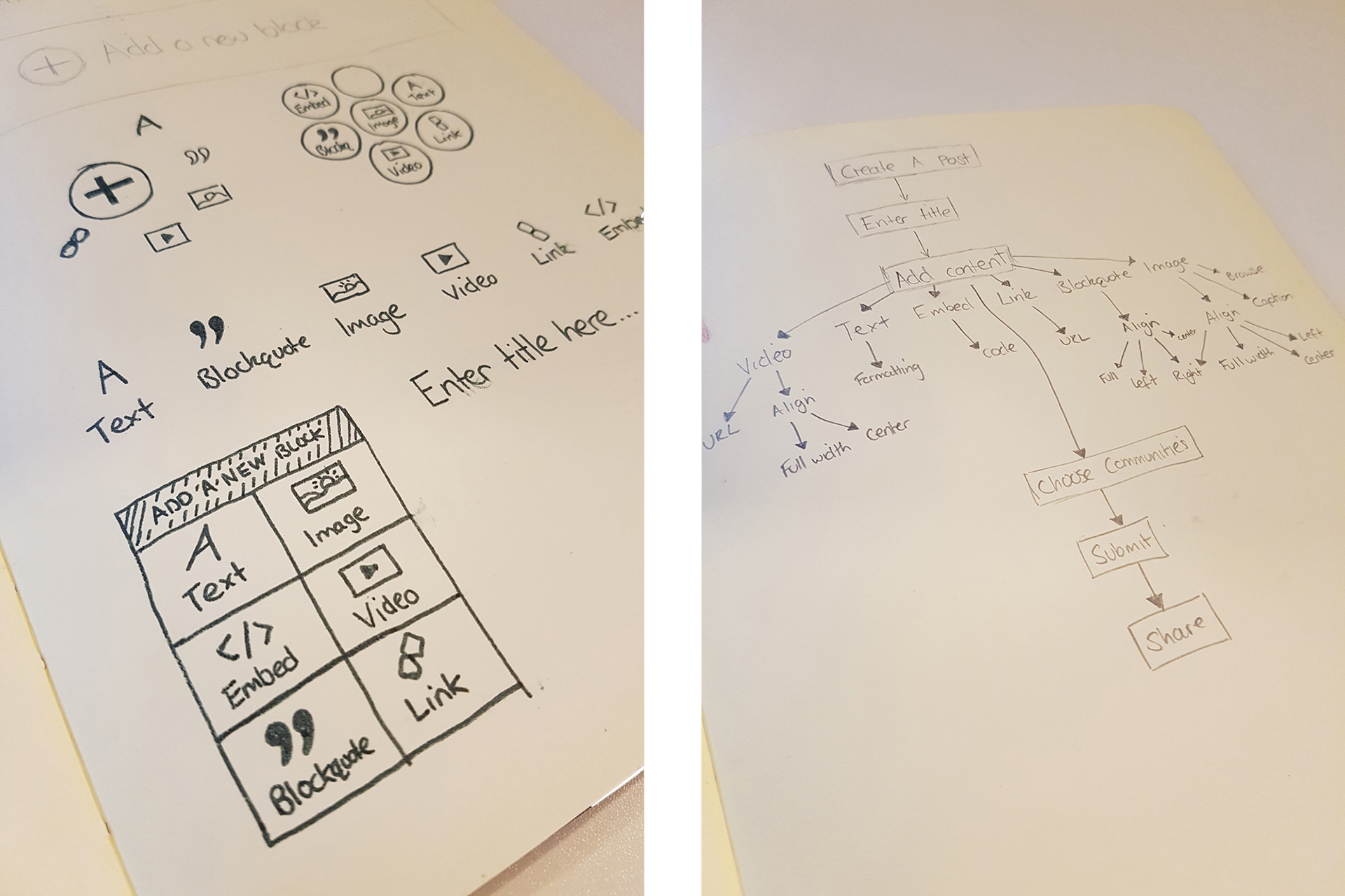
Wireframes for the content editor and brainstorming the 'create a post' process
Wireframes

Wireframes and flow for the login and onboarding
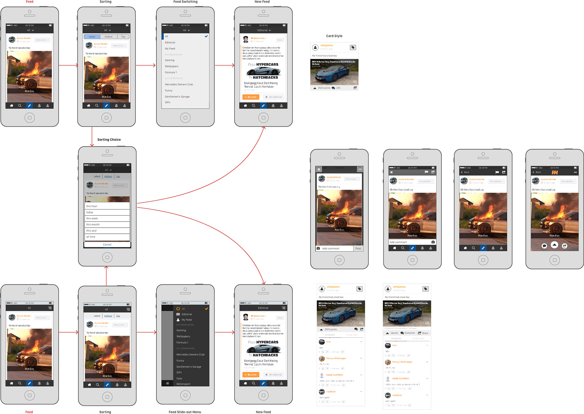
Wireframes for feed navigation and a post UI
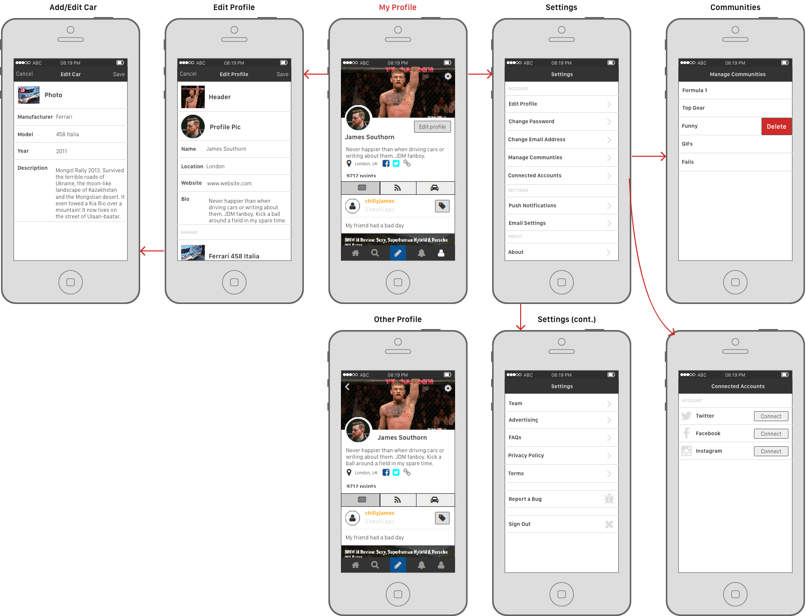
Wireframes for profiles and settings
Concepts

iOS 'Home' concepts

iOS 'Communities' concept

Android 'Home' concepts
Screen Design
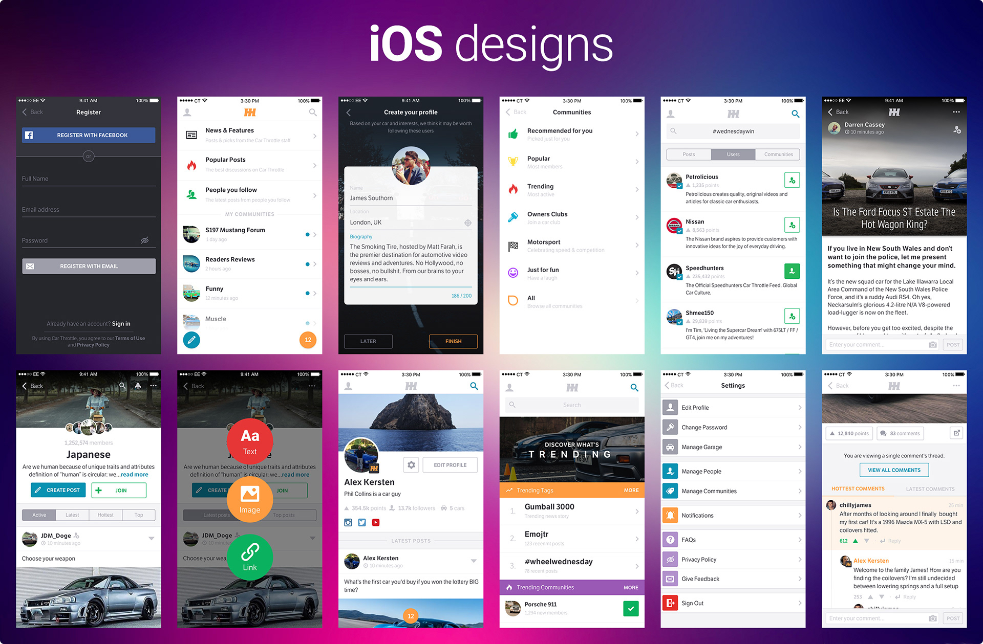
iOS final designs
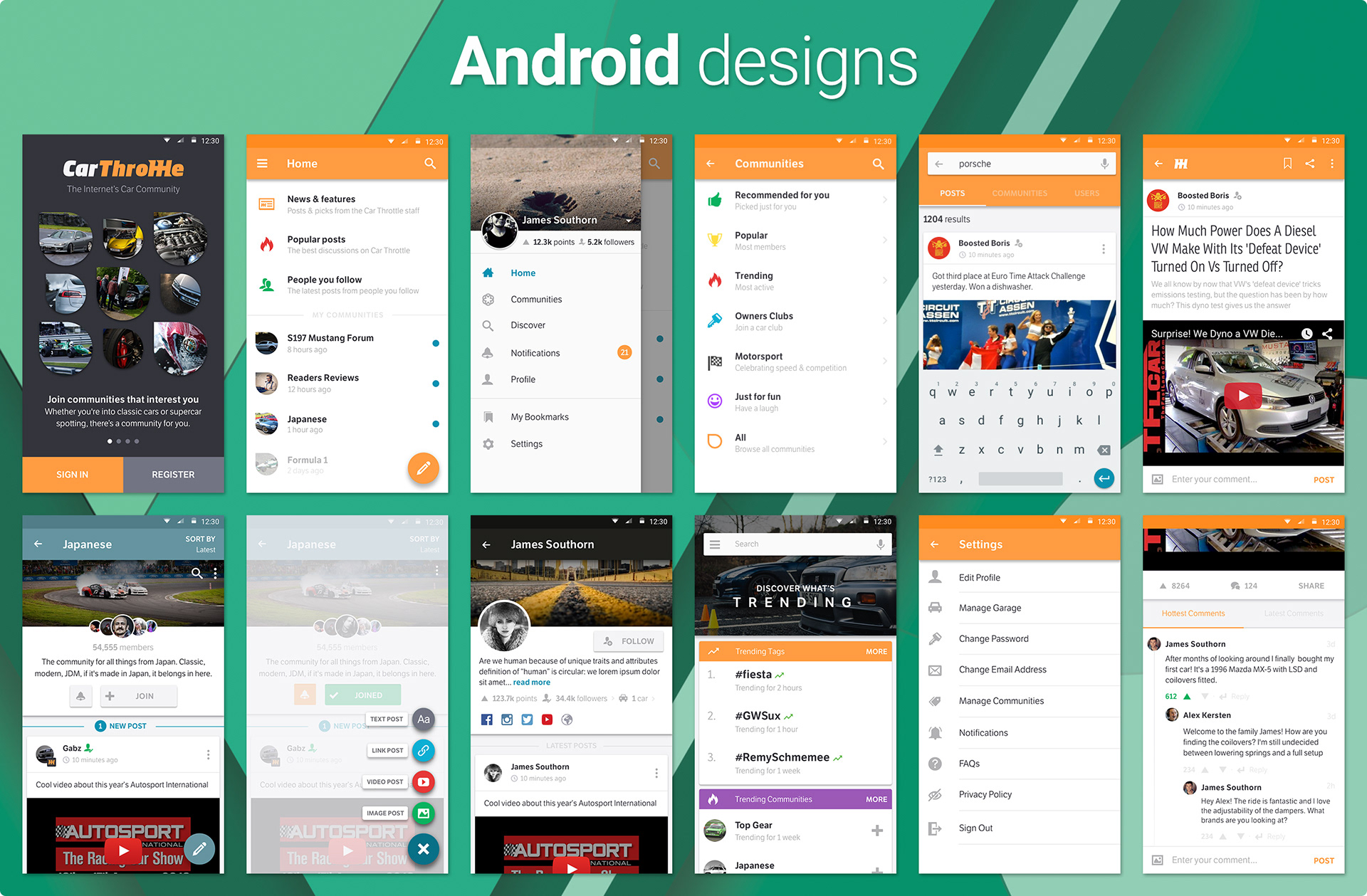
Android final designs
Prototype
App Store ratings
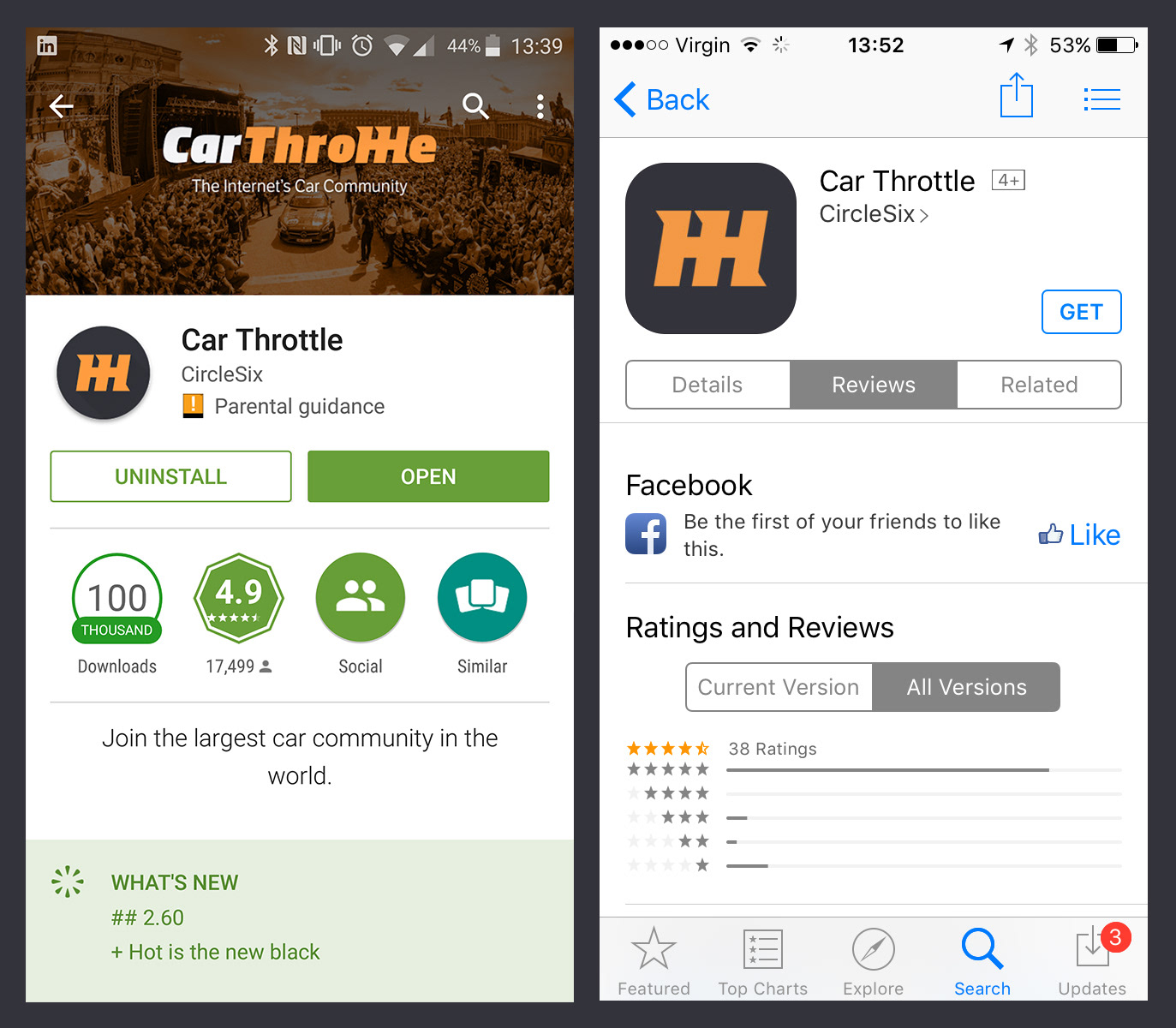
Android and iOS app store reviews