Background
Zava was set up in 2011, known then as DrEd. They are an online healthcare service, providing patients with prescription medication, advice and care. They have a team of over 100 treating over 50,000 patients a month, operating an award-winning platform across 6 countries (UK, Germany, Austria, Switzerland, France and Ireland) and partner with large corporates like Superdrug (onlinedoctors.superdrug.com and healthclinics.superdrug.com).
Project outline
– Re-brand and re-design DrEd to the new company name and vision (Zava) whilst protecting revenue and ensuring our customers were aware and reassured.
– Improve the UX and treatments per day through the new business offering
Solutions
– New branding and visual language for Zava to evoke trust and safety.
– Email campaign, landing page, doctor messaging, medication leaflet and website messaging to reassure existing customers.
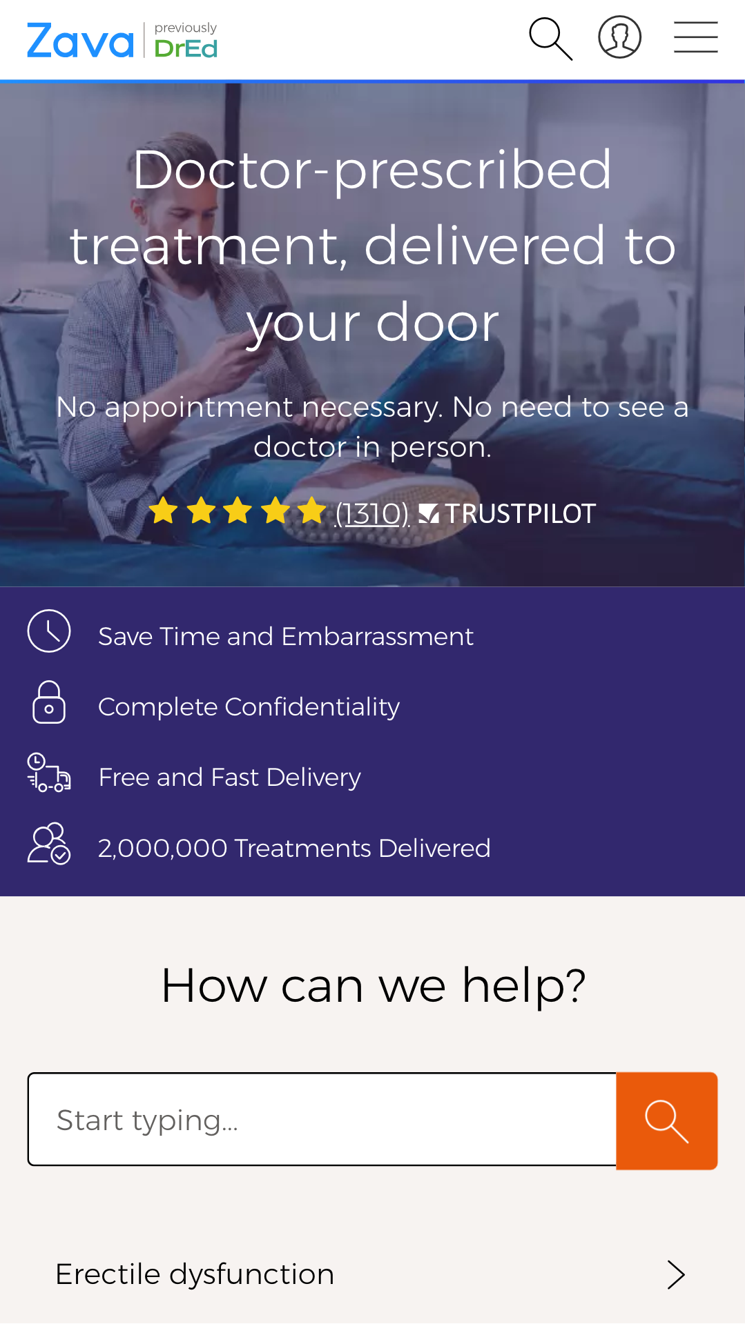
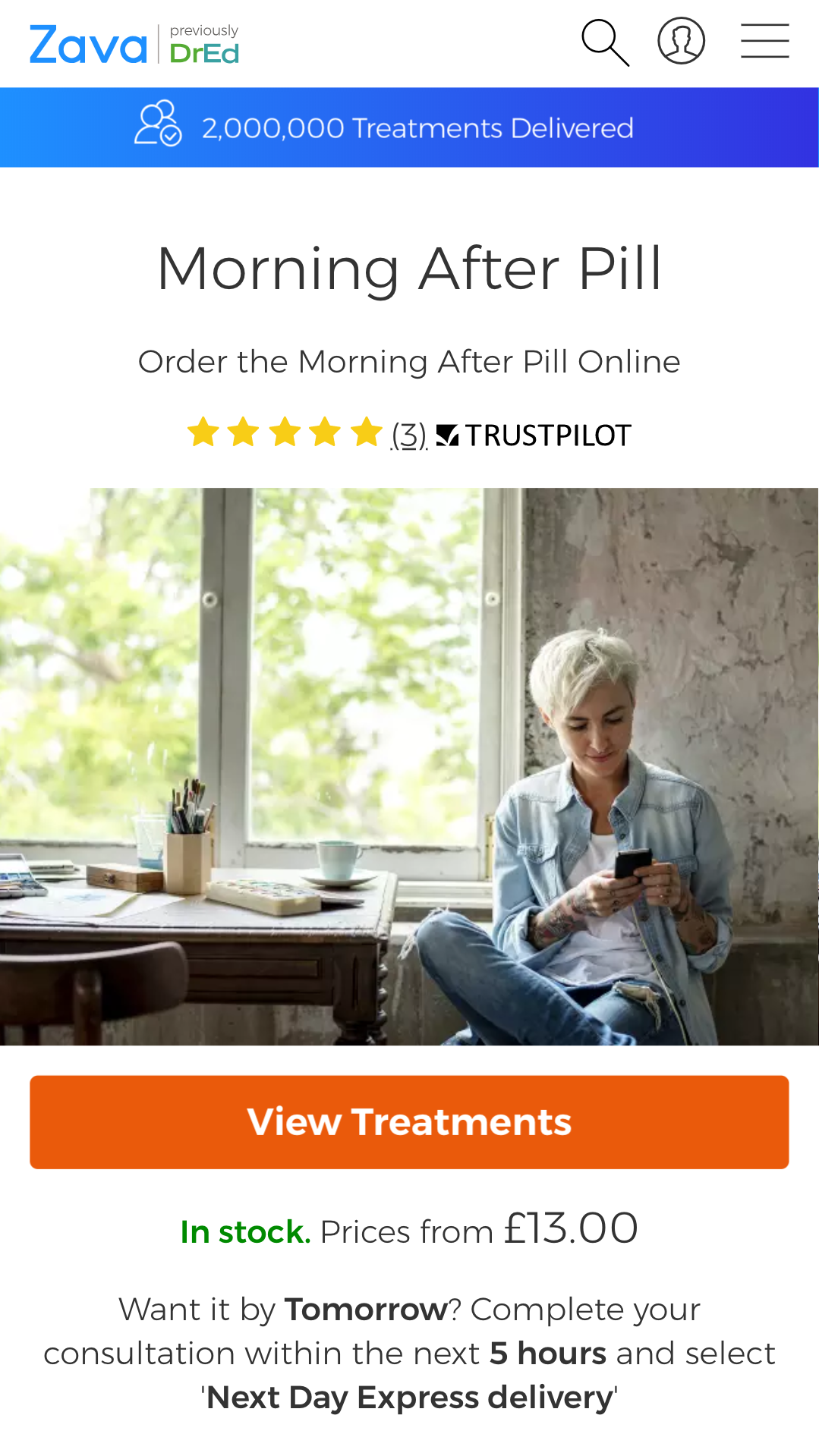
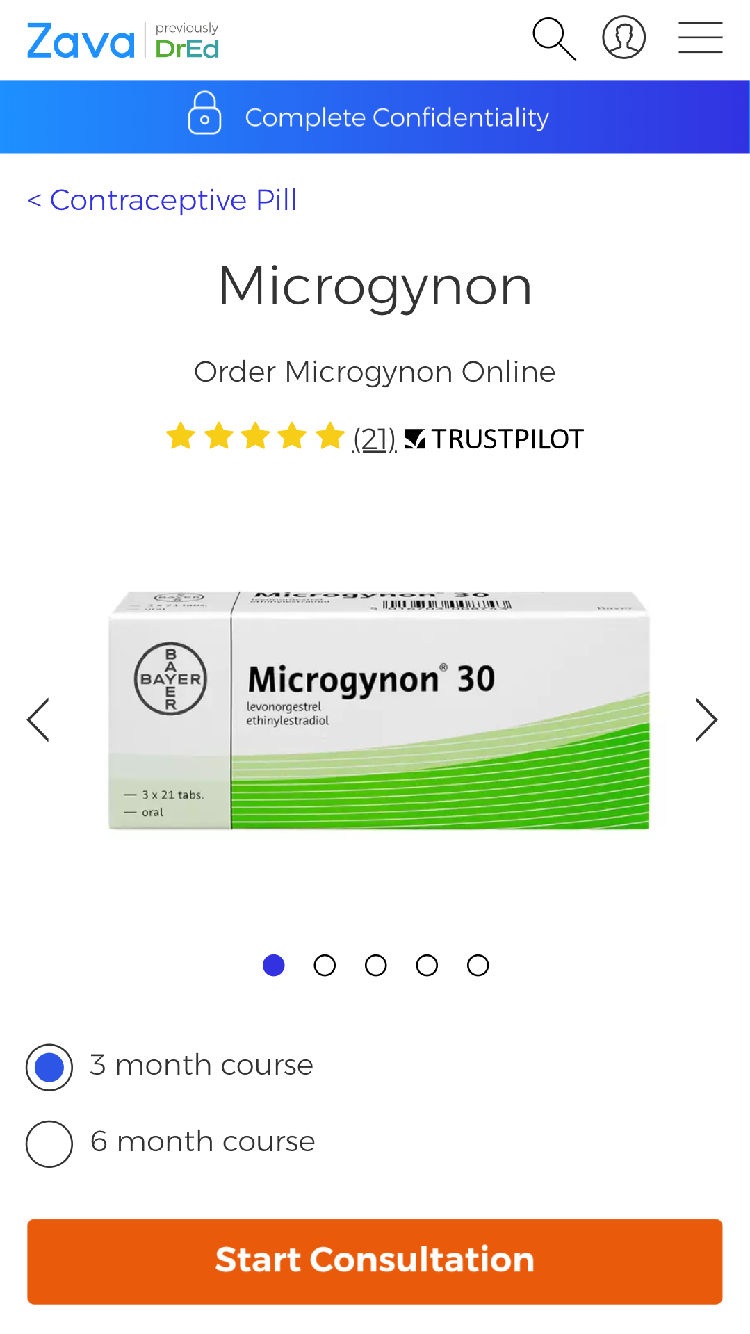
– New and improved UI and UX for the whole product, optimised for mobile.
Outcomes
Through the new redesign and design language and implementation of new tools and workflows, the following major business KPI was achieved:
26%+
increased treatments per day
Also, designer productivity and consistency were improved, while also safeguarding revenue through clear, consistent, and reassuring messaging, as evidenced by positive satisfaction survey results.
Design Process
After we defined the goal and problem, we needed to understand our users problems, needs and emotions and analyse data from our current site, DrEd. We did this using various quantitive and qualitative research methods.
Analytics & data
We used data to help drive our design decisions, so looking at existing DrEd analytics was essential. It helped us to inform which features and pages had value, resolutions and devices to design for (74% mobile traffic), the most common user flows and landing pages and also our demographics and user segments.
Heat-maps
We used Hotjar to create heat-maps for specific pages. This was useful to see what content and elements users engaged with and gain insight into scroll-depth - especially on mobile.
Existing research
Our research team had a wiki where I was was easily able to dig into into previous research and insights to help uncover relevant problems.
Interviews
With our research team, I helped facilitate or participate in face-to-face interviews with our users and potential users. This helped us get insight into the "why" behind the "what" and dive deeper into mental models and empathise with users problems.
User testing
Remote unmoderated and moderated user testing helped us quickly test DrEd and competitors to gain usability insights. This usually involved speak-out-loud testing, 5-second tests and task-based tests.
Ideation
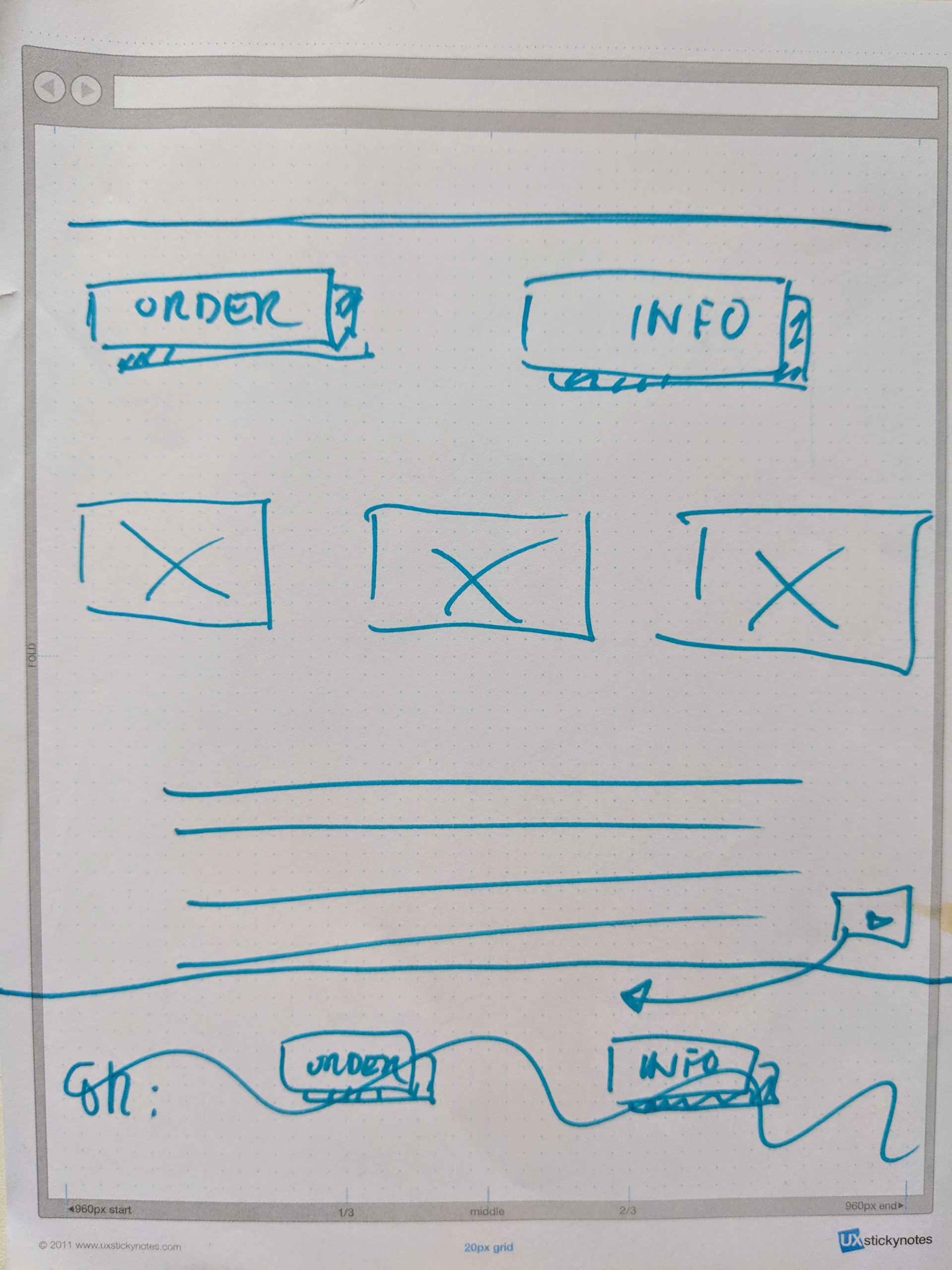
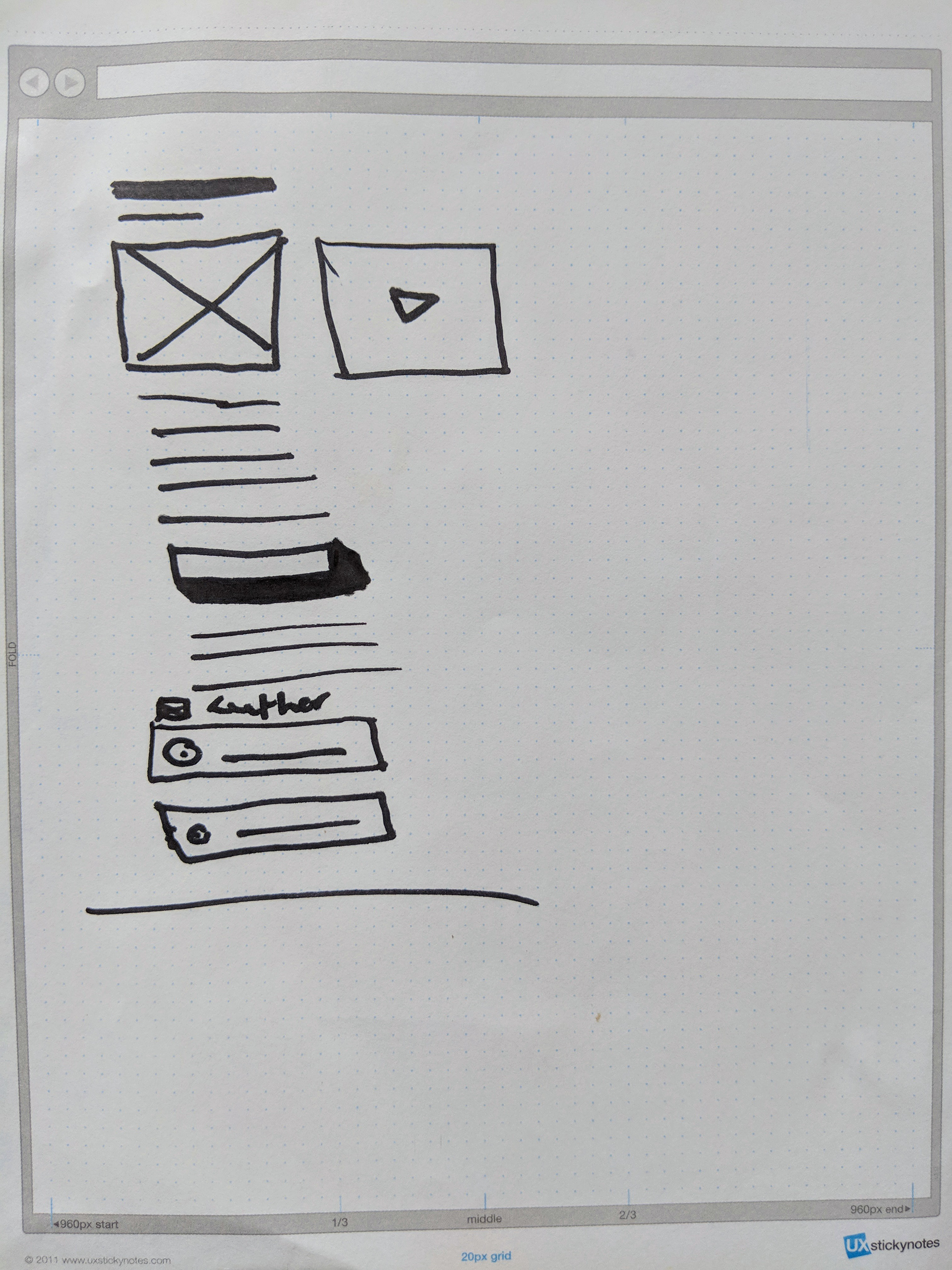
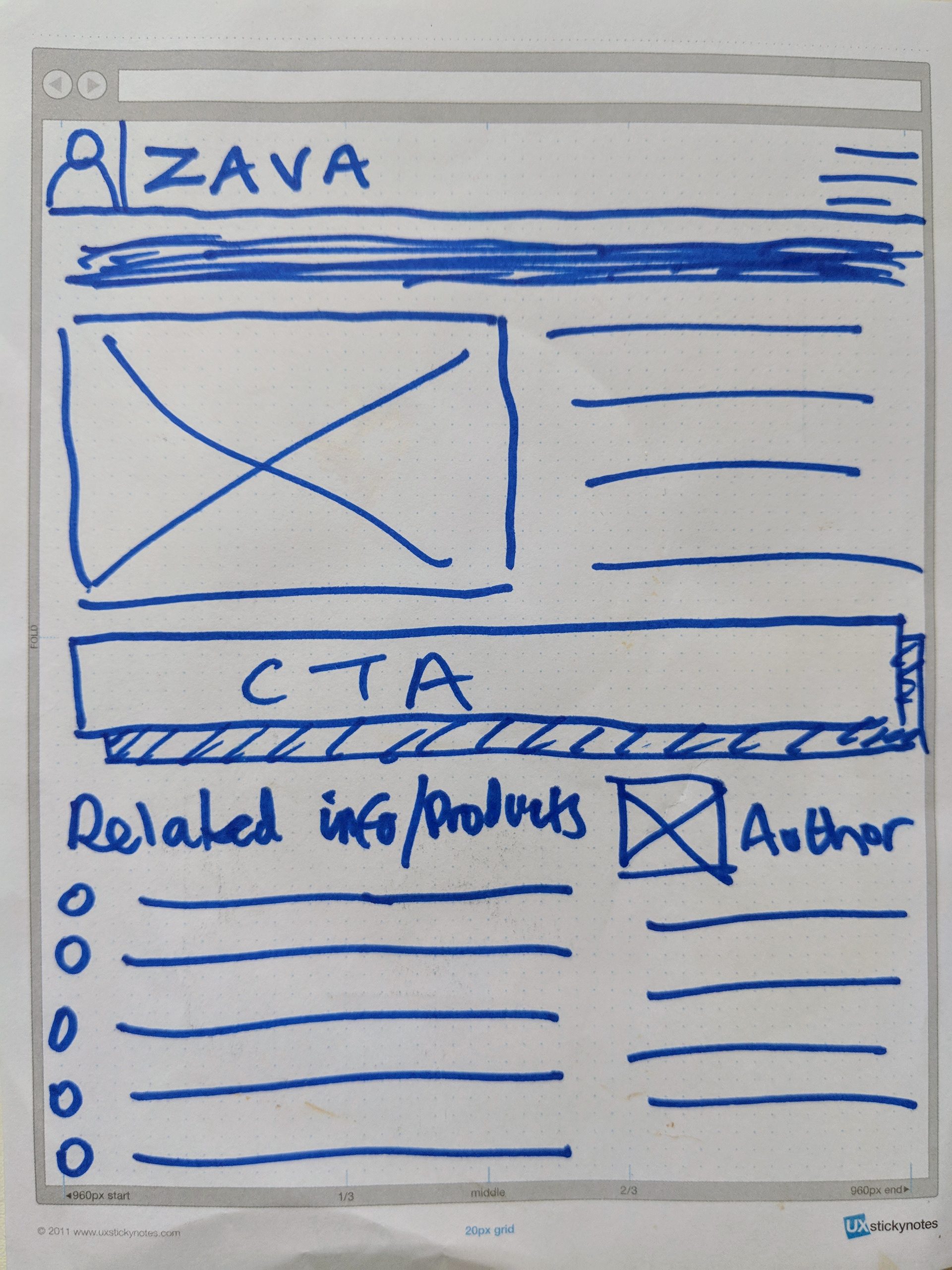
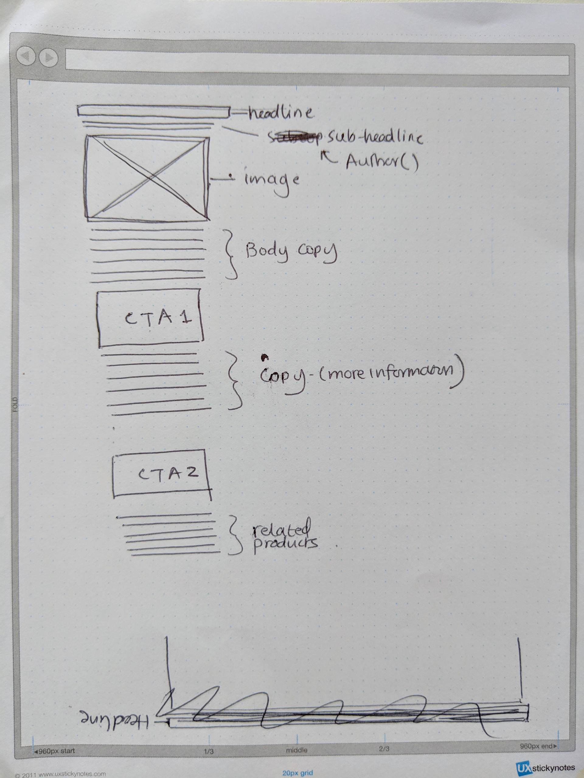
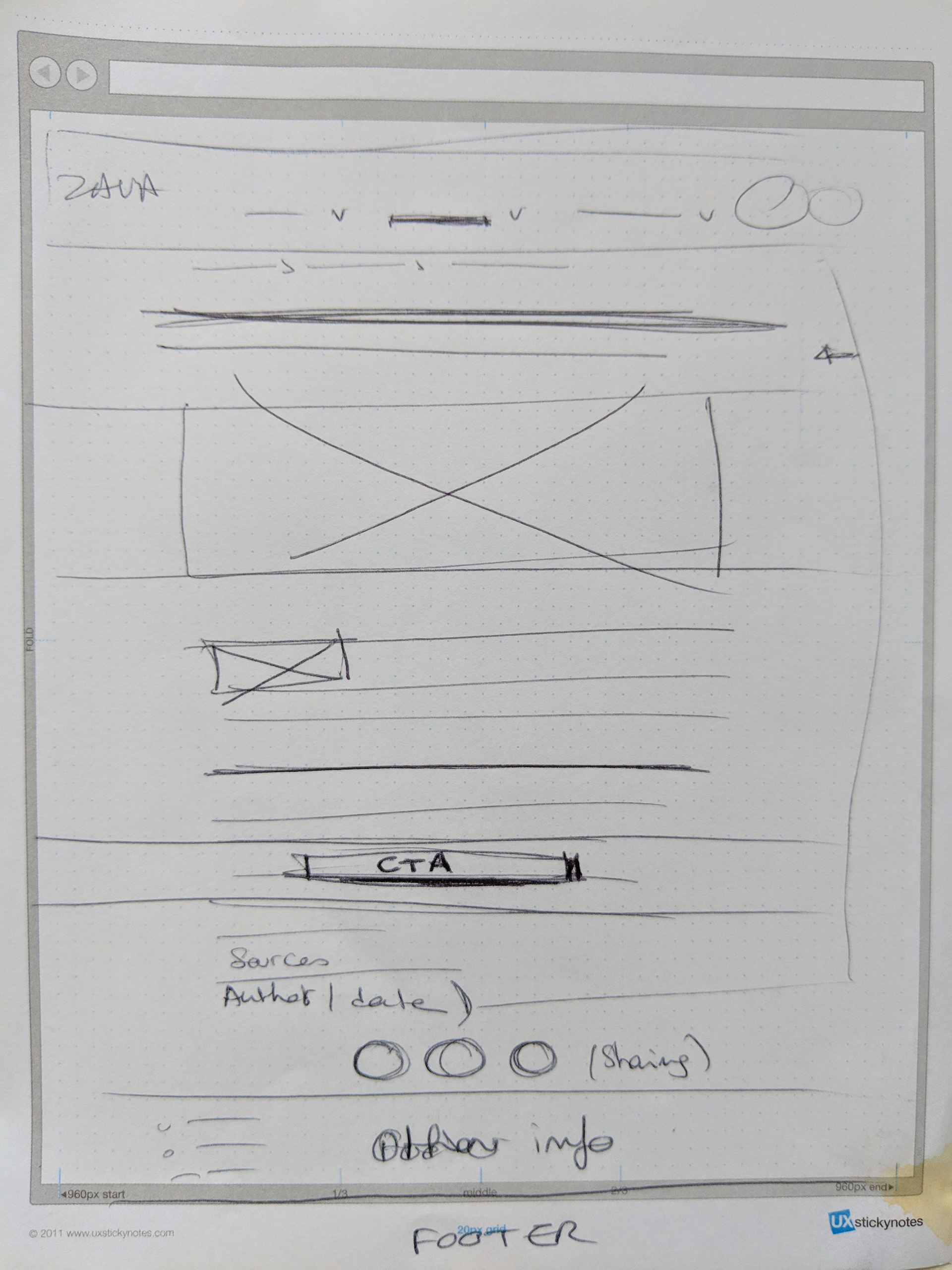
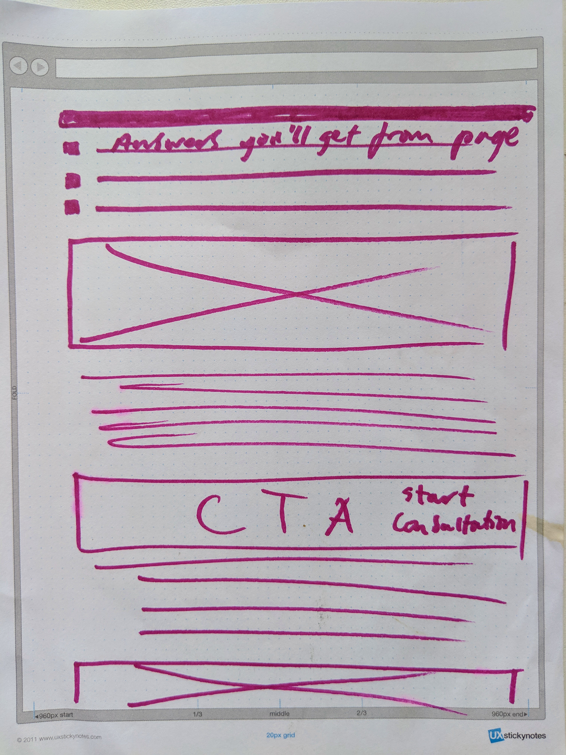
After unearthing insights and user problems/needs, we moved into ideation work. A few workshops were facilitated with various stakeholders across the business (marketing, doctors, pharmacy, engineering etc.) where research was shared and exercises were conducted to quickly gather ideas.
Below are some stakeholder sketches from a content page workshop.
Doctors in a workshop
Wireframes
It was then my job to go away, analyse the sketches and design some low-fidelity wireframes. Here are some of the low-fidelity wireframes for the product page and content page.
Content page wireframes
Content page mobile "fold" and module exploration
Design language
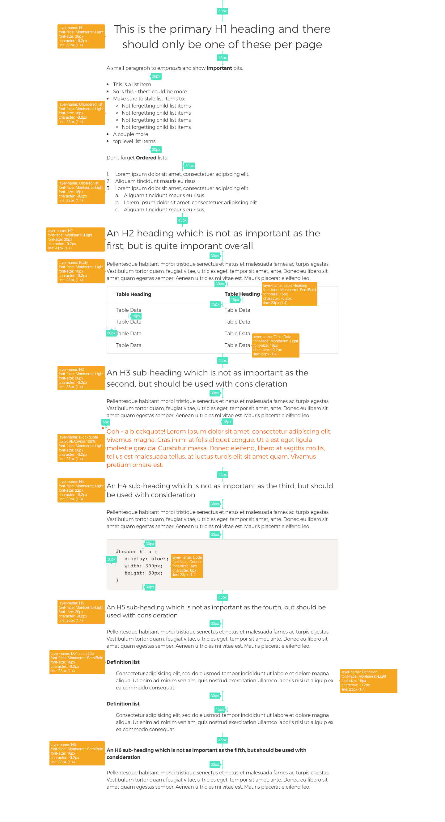
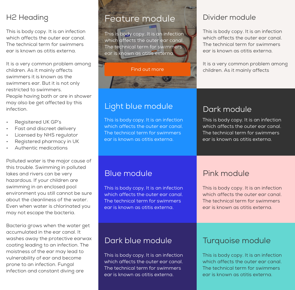
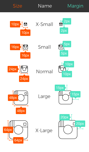
Before jumping into the visual design process, I created some foundations for design to enable consistent, efficient and rapid design. I started by exploring perceptual and functional patterns for the product.
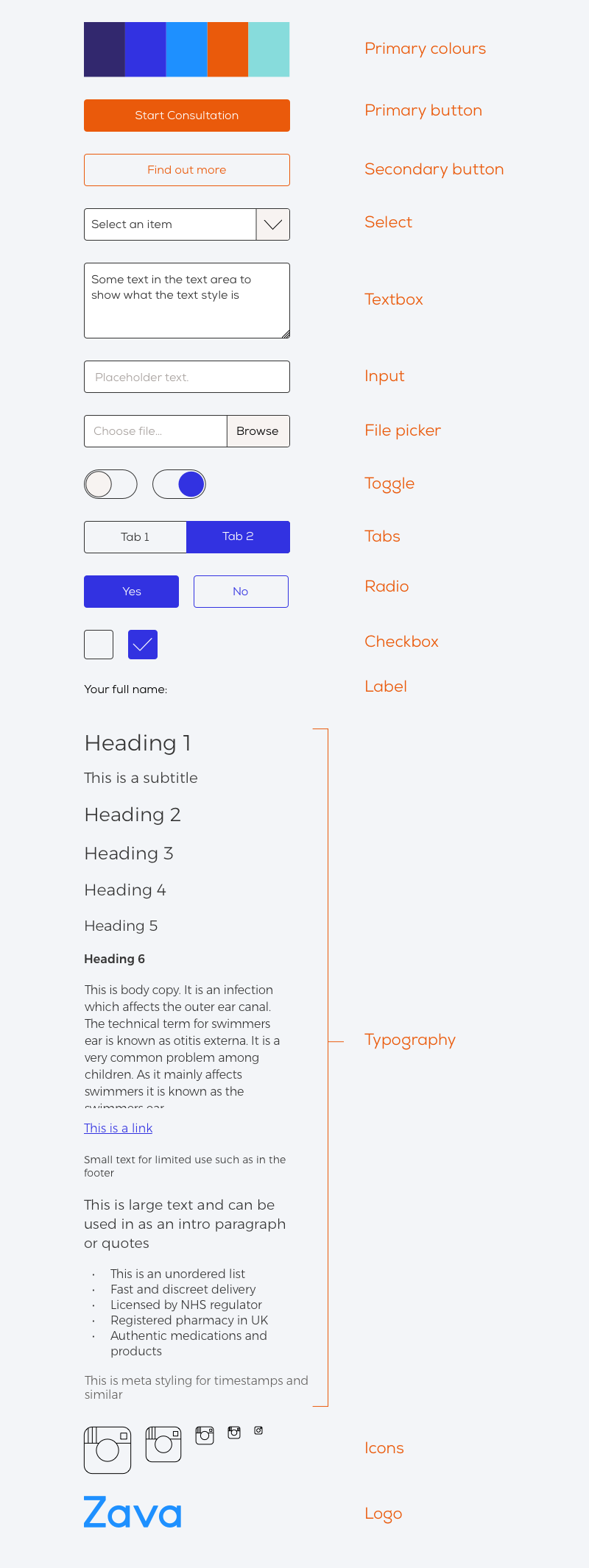
Zava product colour palette
Visual design
After the wireframes were complete, we were all aligned, and the style guide/design language was finished, it was time to create a some high-fidelity visual designs and patterns.
Content page designs
Final mobile page layouts in Sketch
Final desktop page layouts in Sketch
Using InVision for developer handover, prototyping and specs.
Final designs
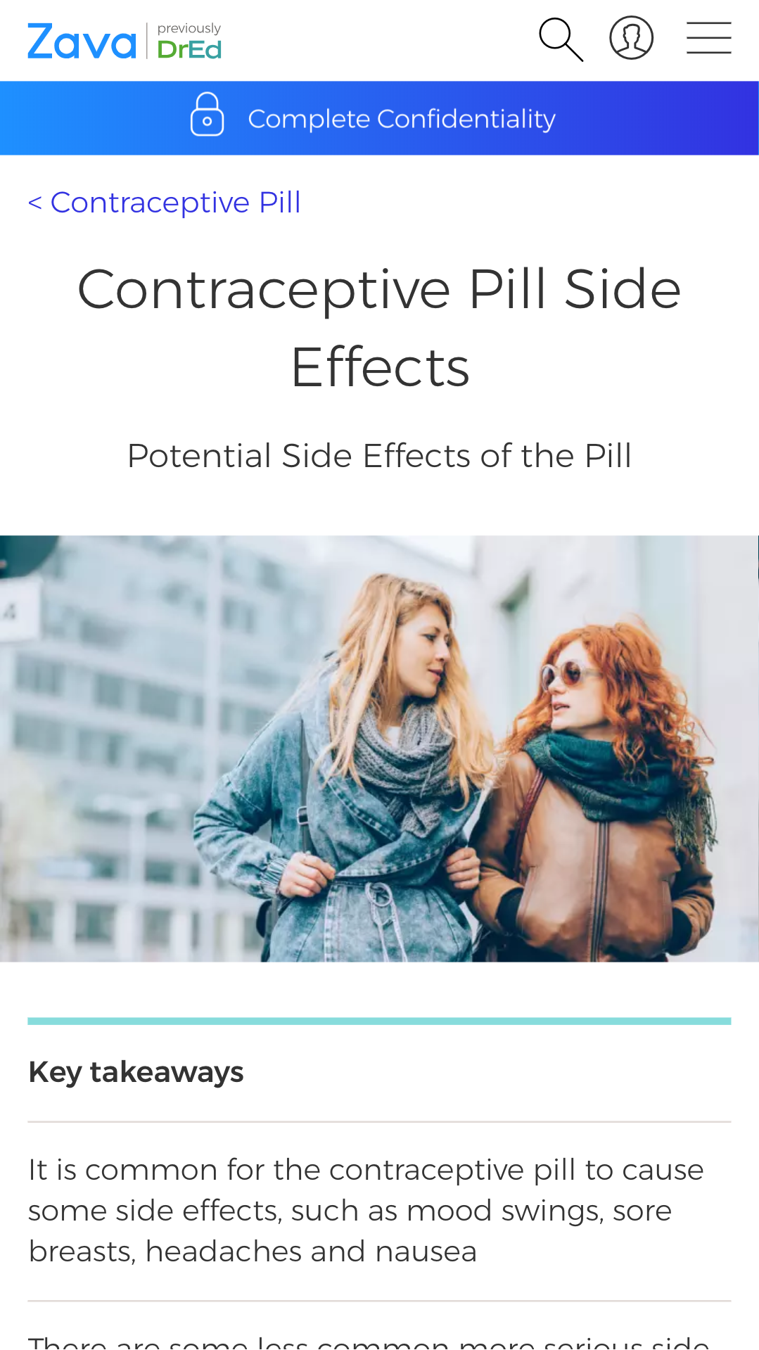
Content page - before and after
Service page - before and after
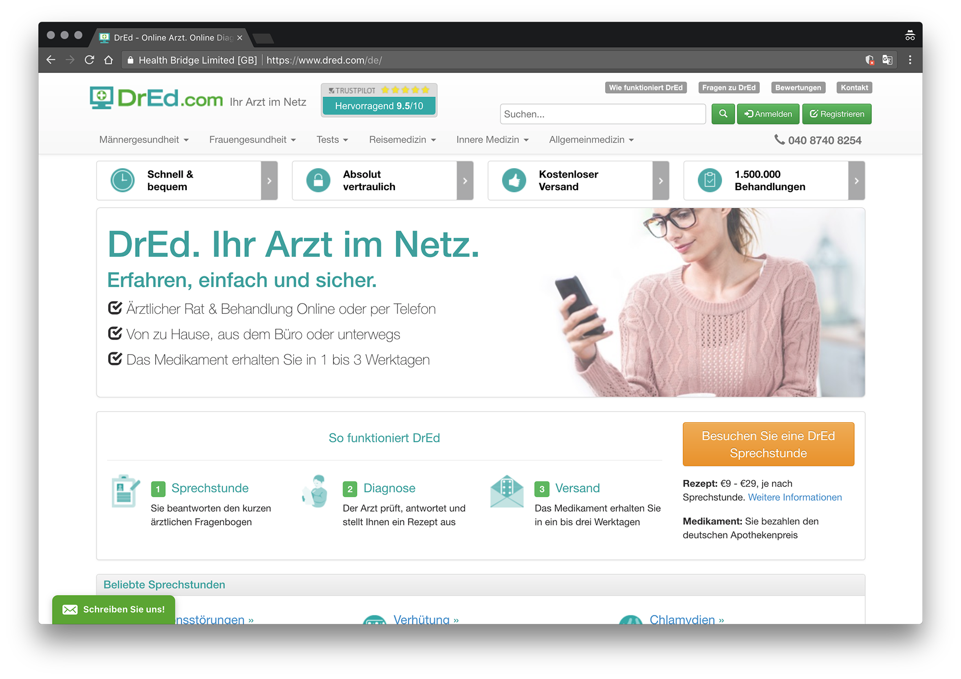
Home page - before and after
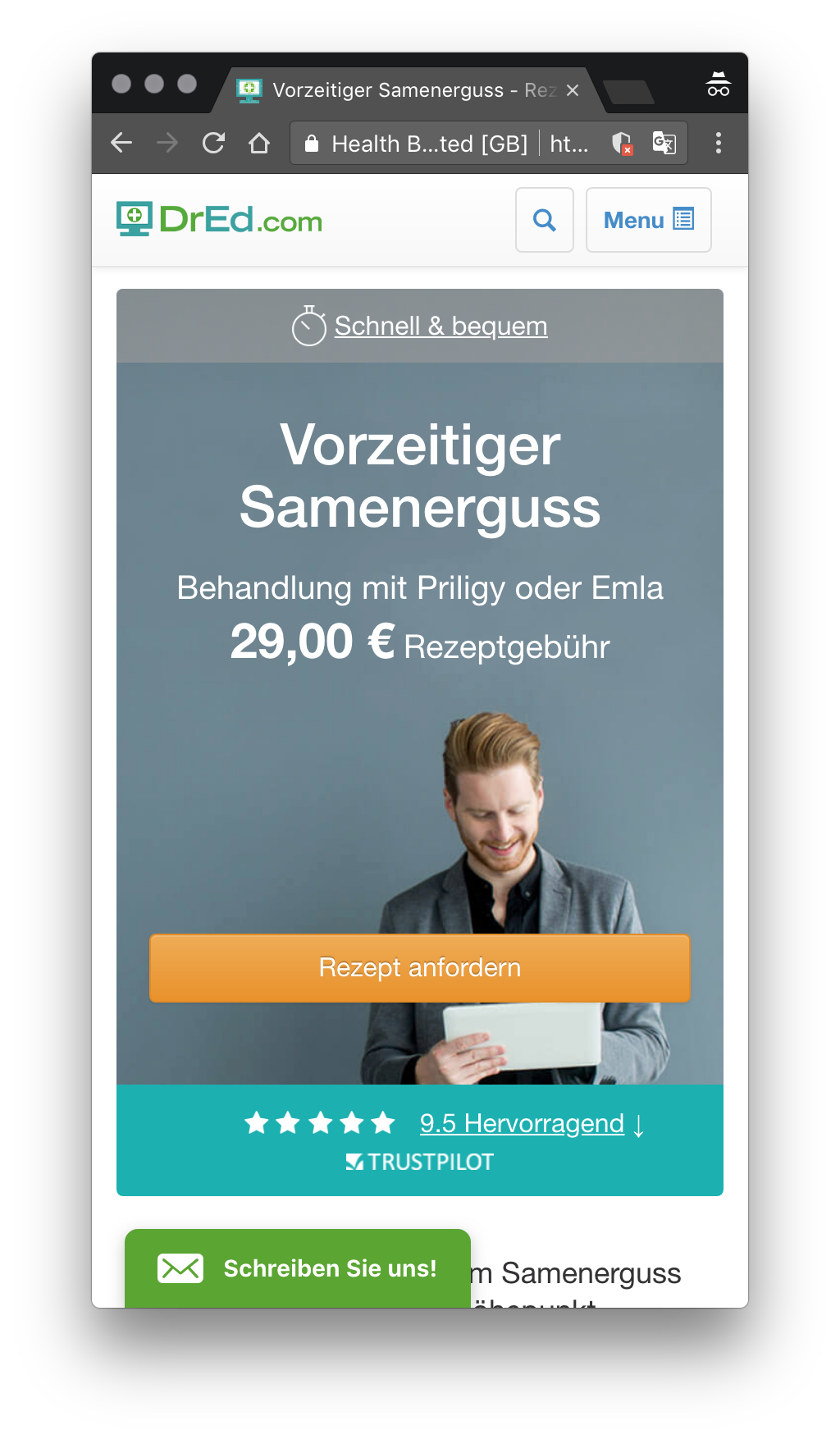
Product page - before and after
Testing
It was important to test the UI and page layouts throughout the design process to ensure it resonated with our users and solved their problems. This taught us a lot, helped us validate ideas and helped refine our design and gain empathy for the users.
UsabilityHub tests
WhatUsersDo user testing
Prototype
I created a prototype to test flows, features and pages internally and externally during the design process - constantly improving and iterating on it. Click here to view the InVision prototype in a new window
Accessibility
As a healthcare company, accessibility was very important for us and our users. This meant making sure that our web pages and applications were available to everyone, including people with disabilities.
The led to me creating an explicit policy for Zava, stating we would have Level AA Conformance to Web Content Accessibility Guidelines 2.0. Working with stakeholders and engineers to ensure best practices and compliance, we managed to launch an accessible site without any violations.
Zava accessibility policy
aXe accessibility checker in Chrome inspect tool showing zero violations

