Hero video ad
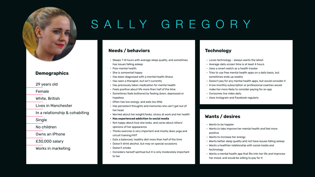
Proto-persona v1
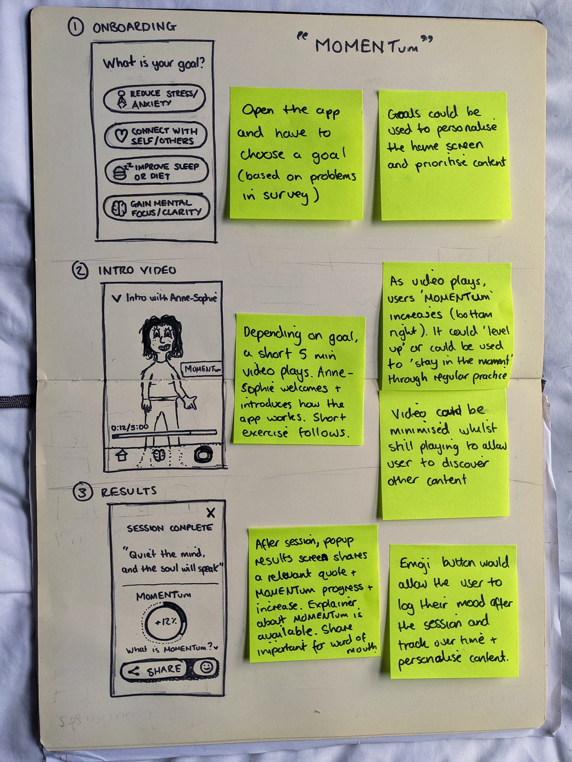
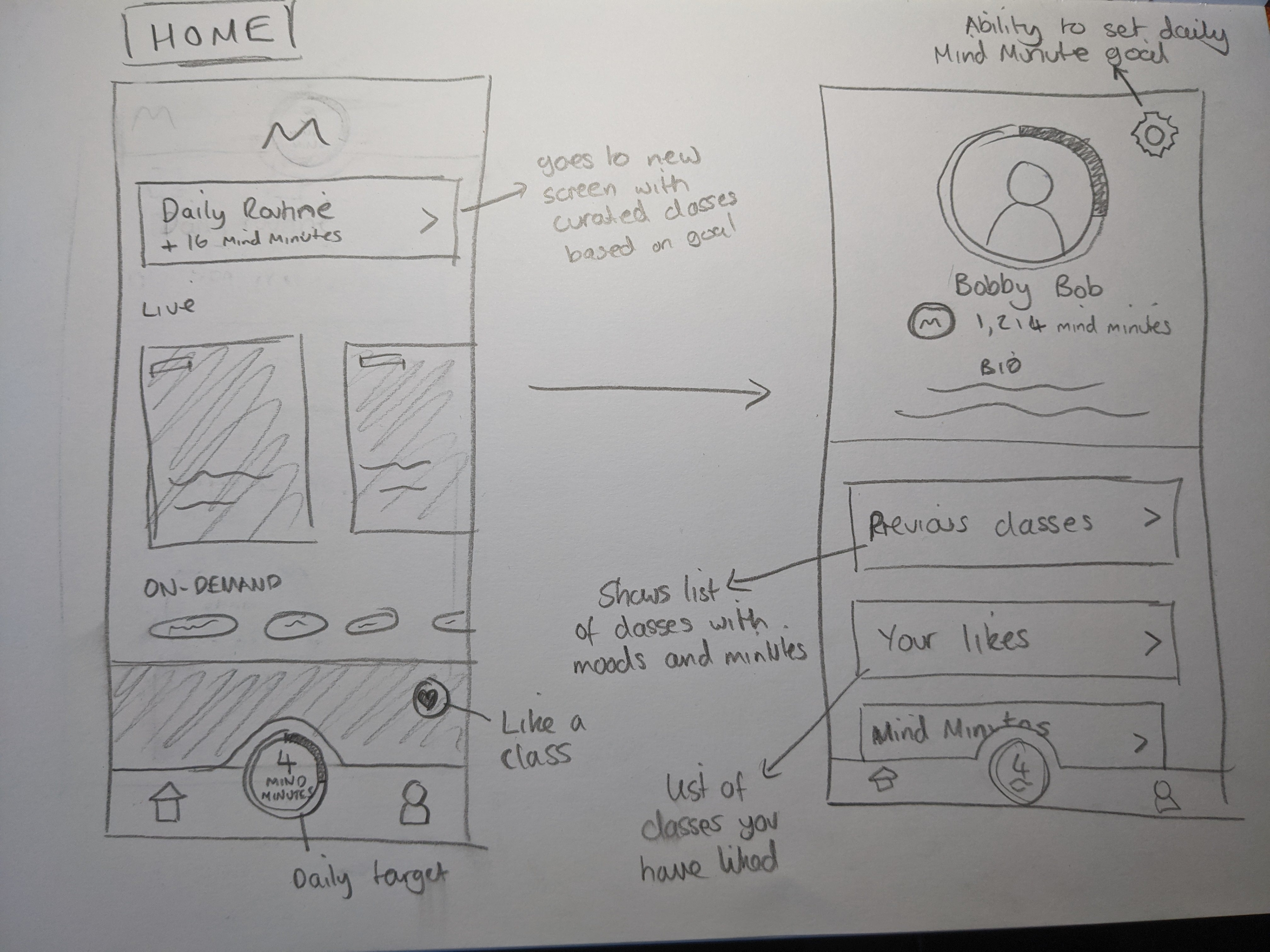
Storyboard sketch
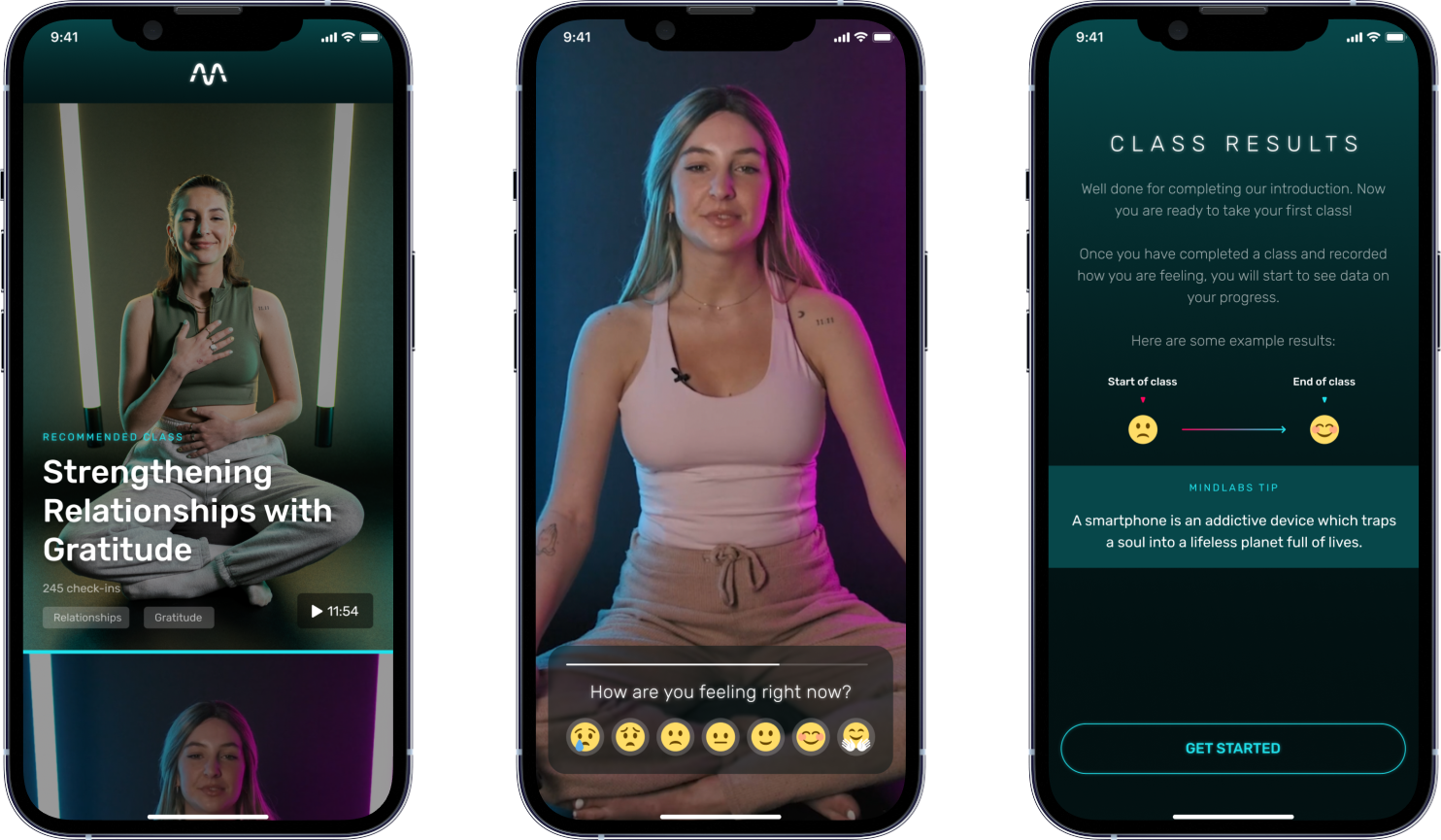
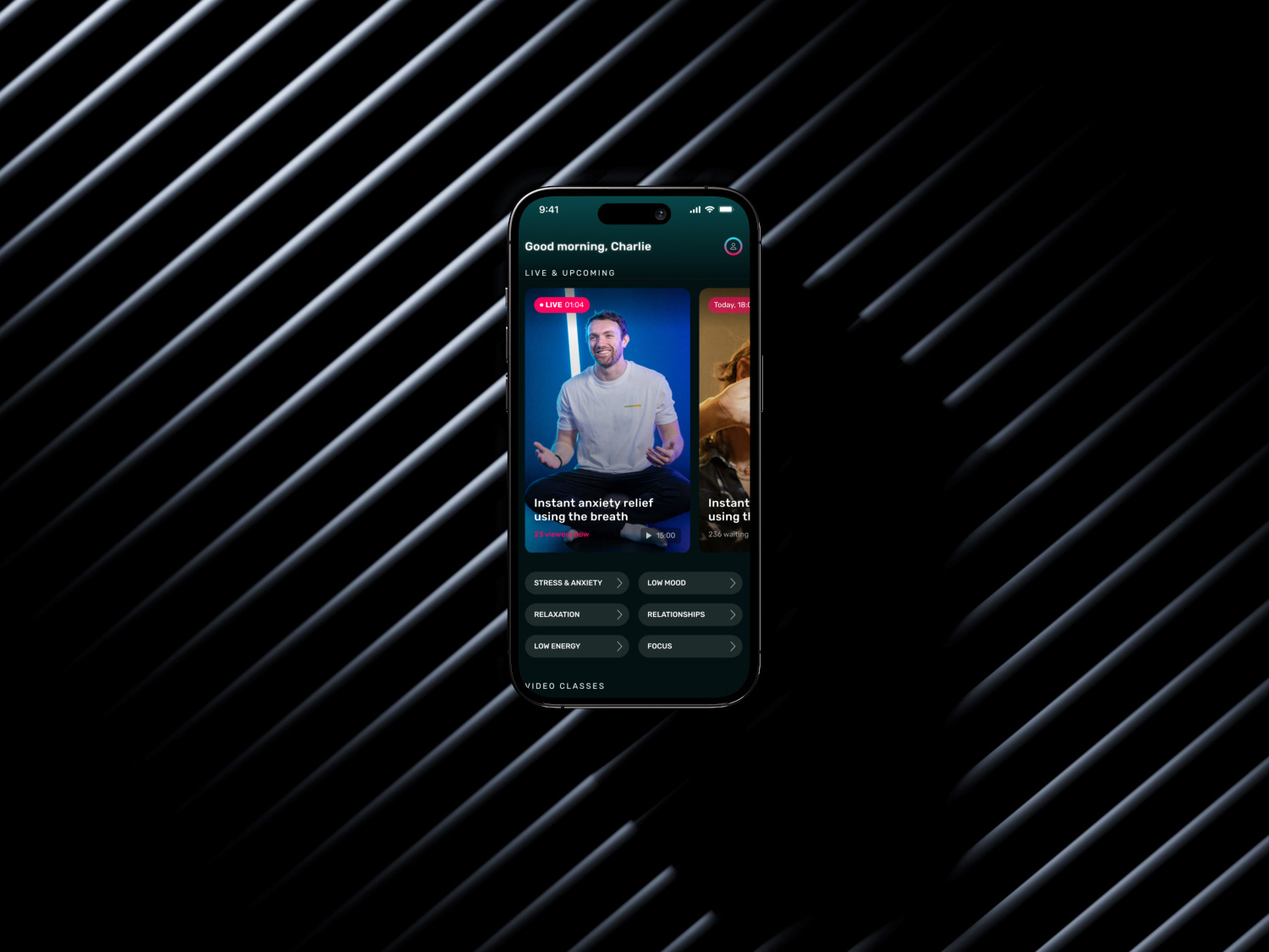
Screen design for the MVP home screen, class, and results
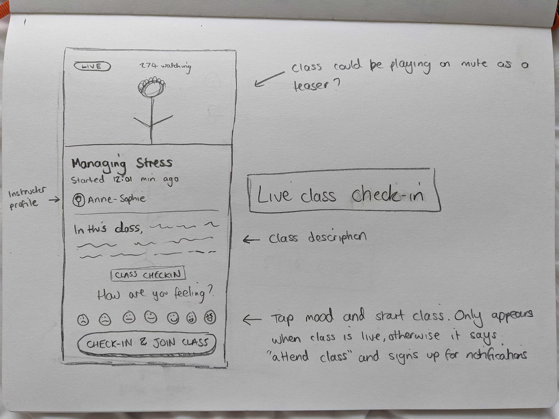
Storyboard sketch
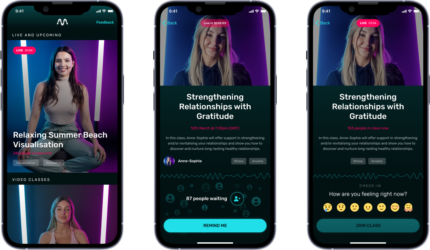
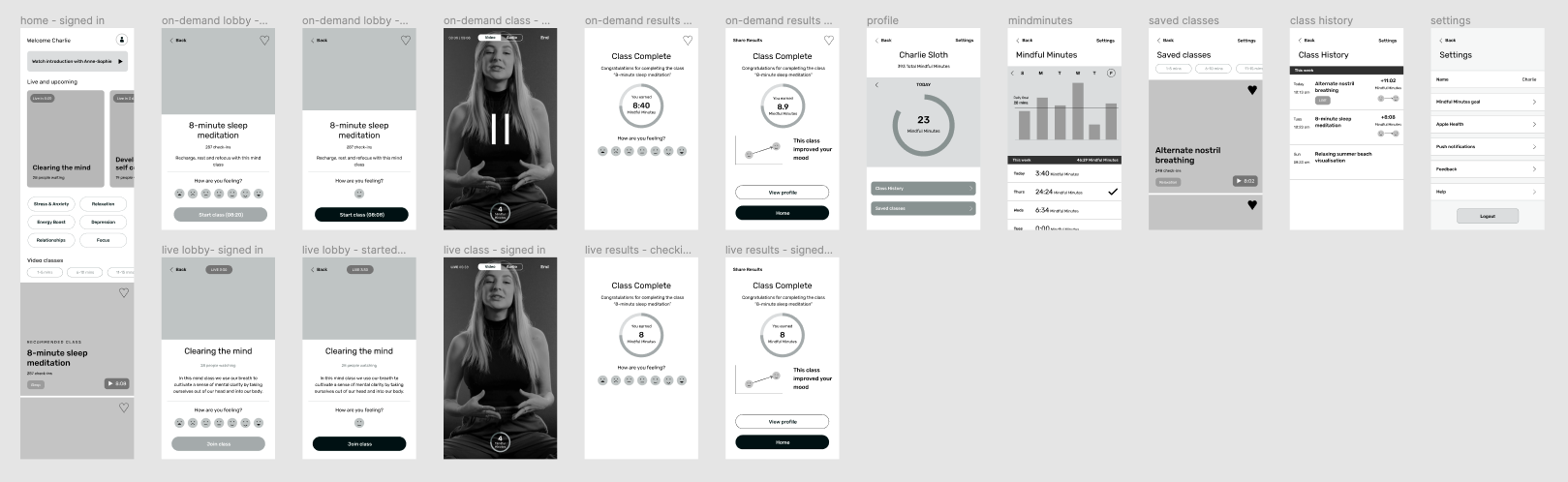
Screen design for the updated home screen, and live lobby states
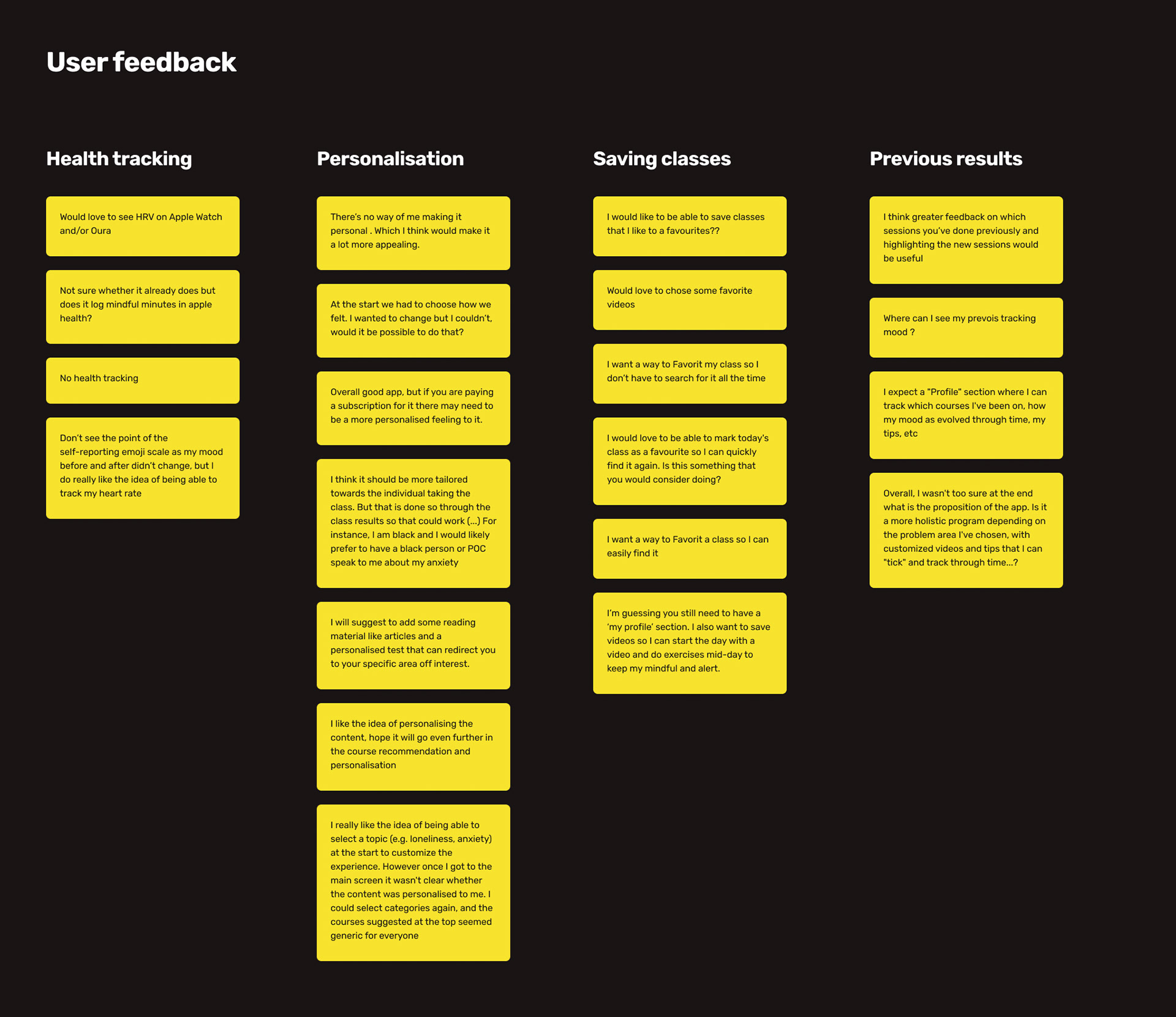
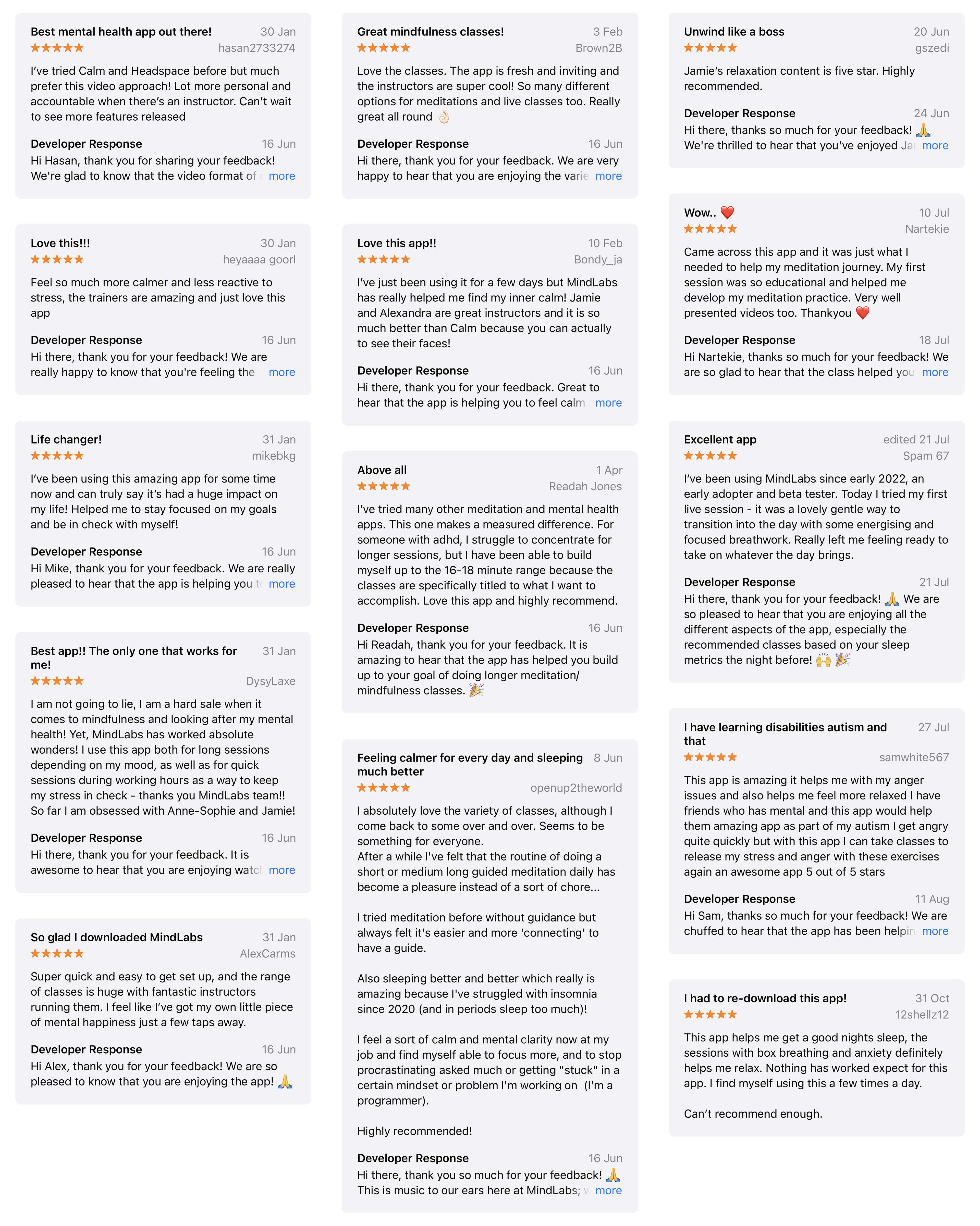
User feedback from user testing and surveys
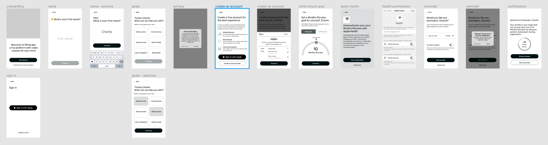
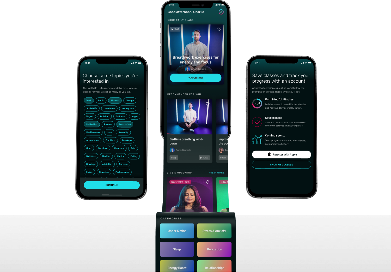
Wireframes for new onboarding and updated UX
Updated home screen with sliders and categories
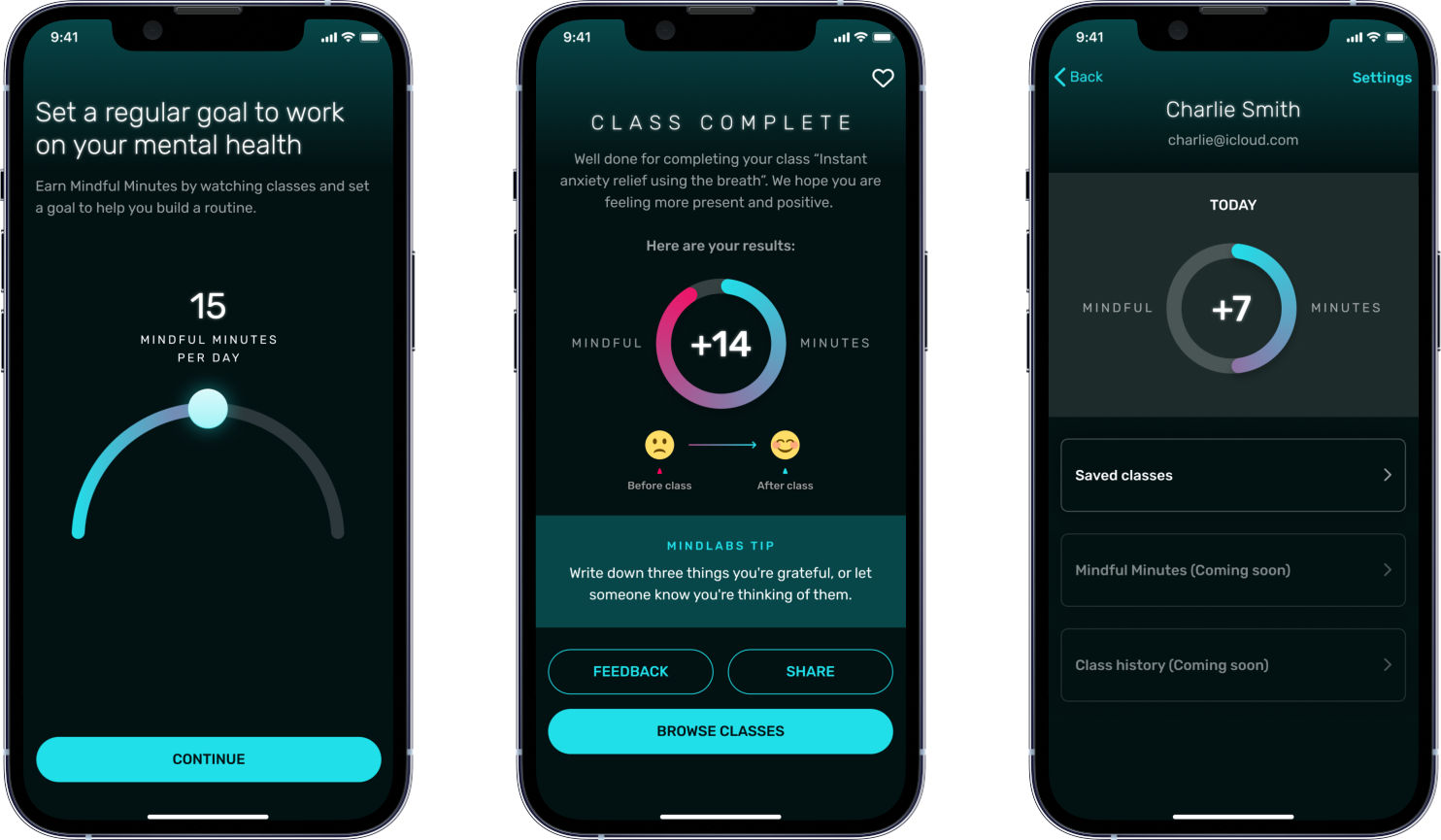
Screen design for the new onboarding steps, class results, and profile
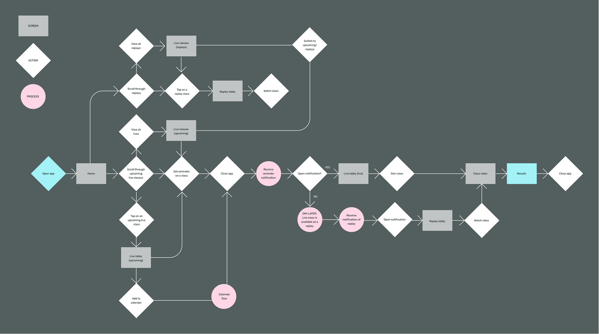
User flow for replays
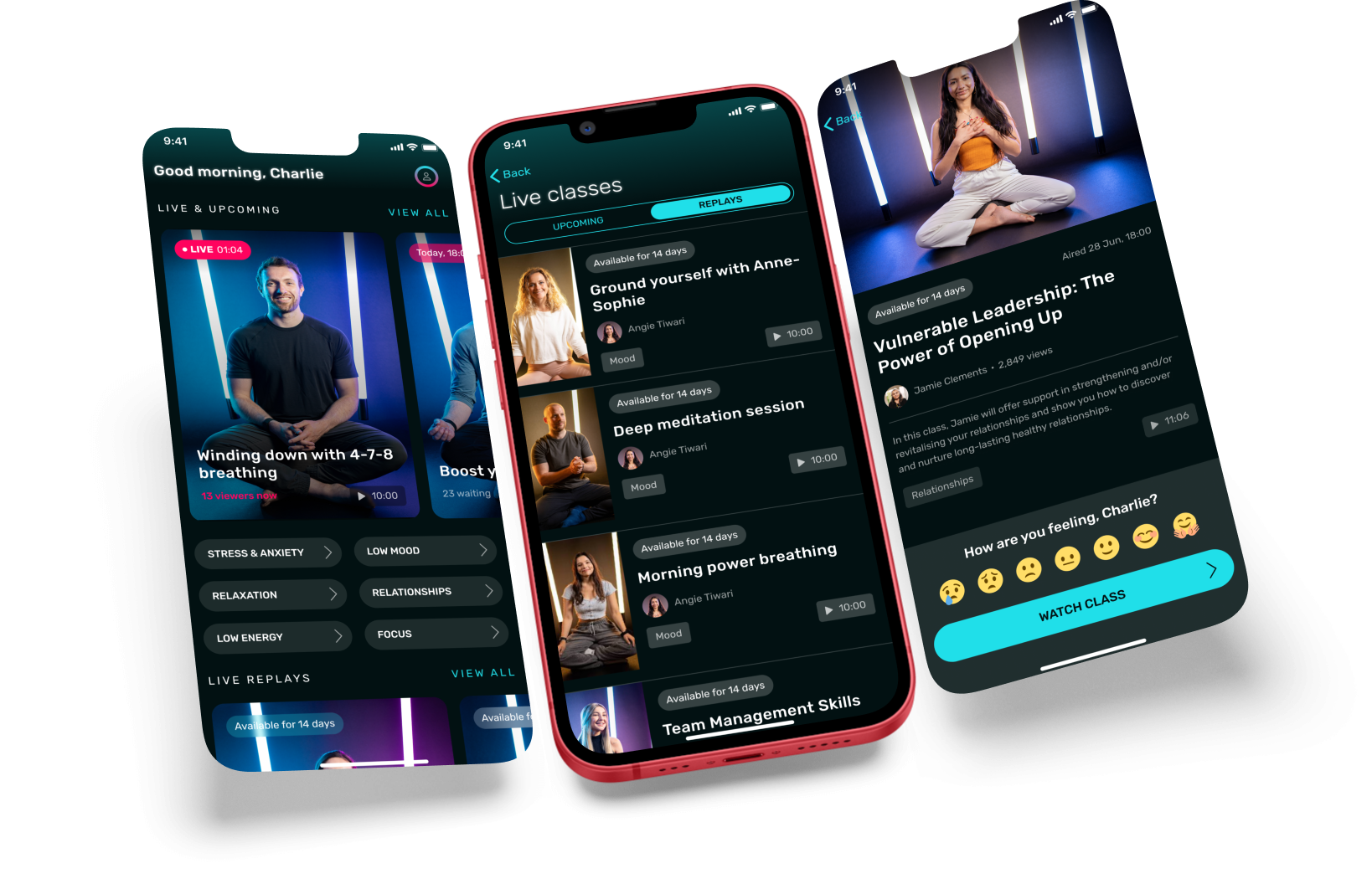
Screen design for the updated home screen, replay/live schedule, and replay lobby
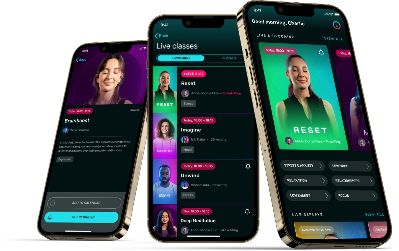
Screen design for the updated home screen, live schedule, and lobby
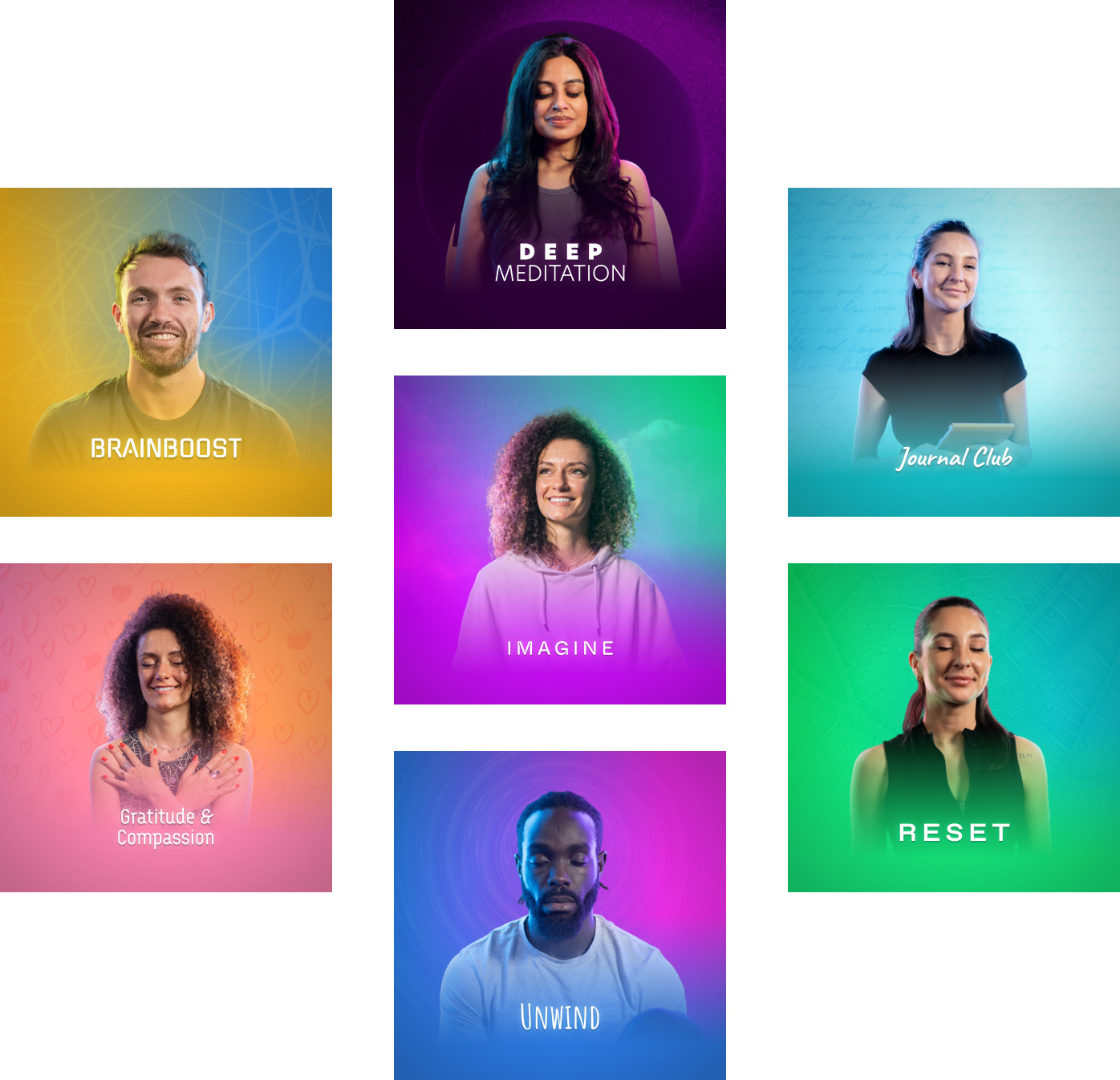
Cover art and identity for each branded class
Screen design for the new onboarding personalisation, updated home screen, and account creation
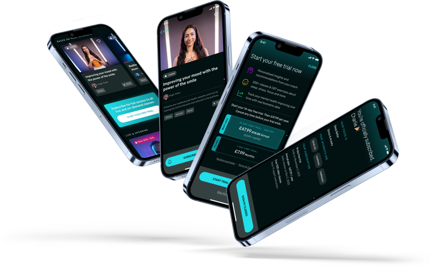
Screen design for putting certain features behind a paywall and subscription steps
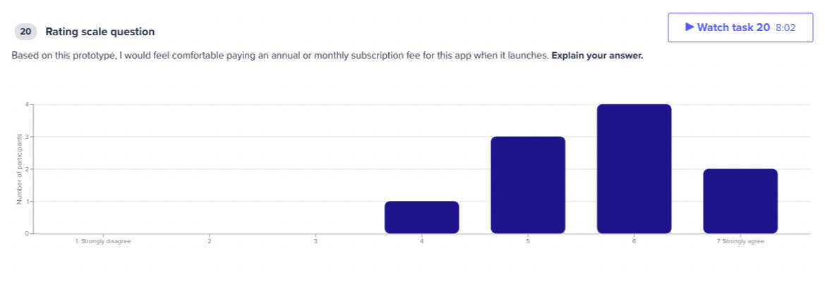
Results from one of the user tests
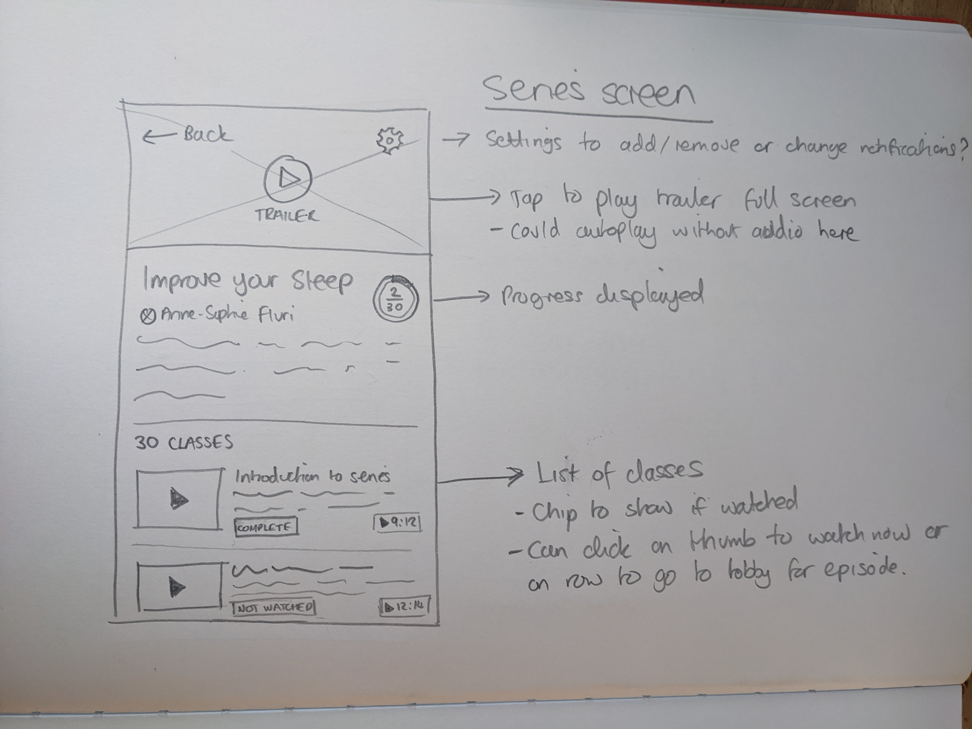
Storyboard sketch for series
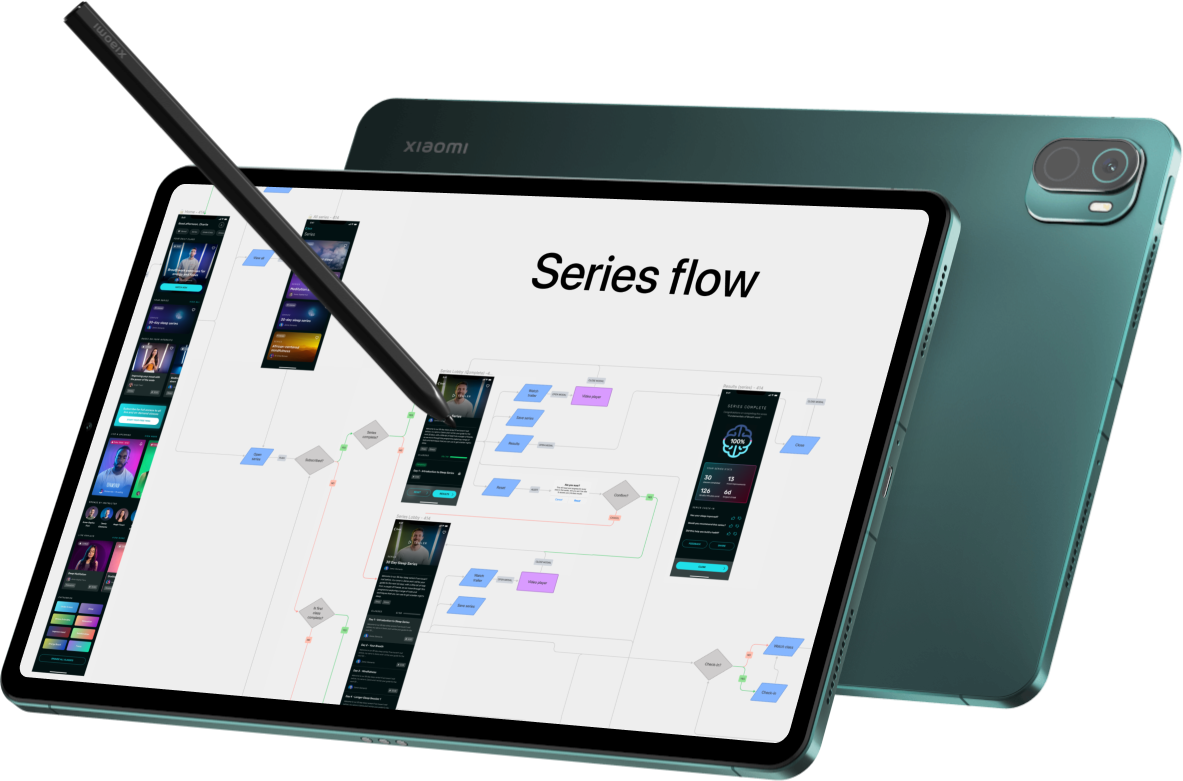
Screen designs and flows for Series
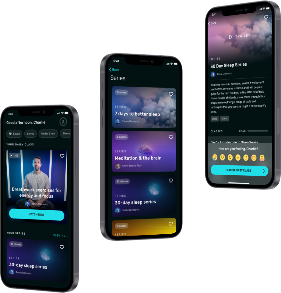
Screen designs for series on the home screen, category, and lobby
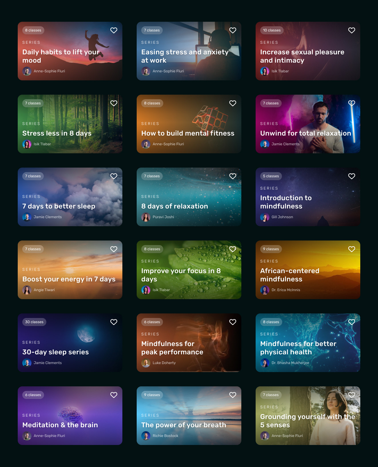
Series cover art designs
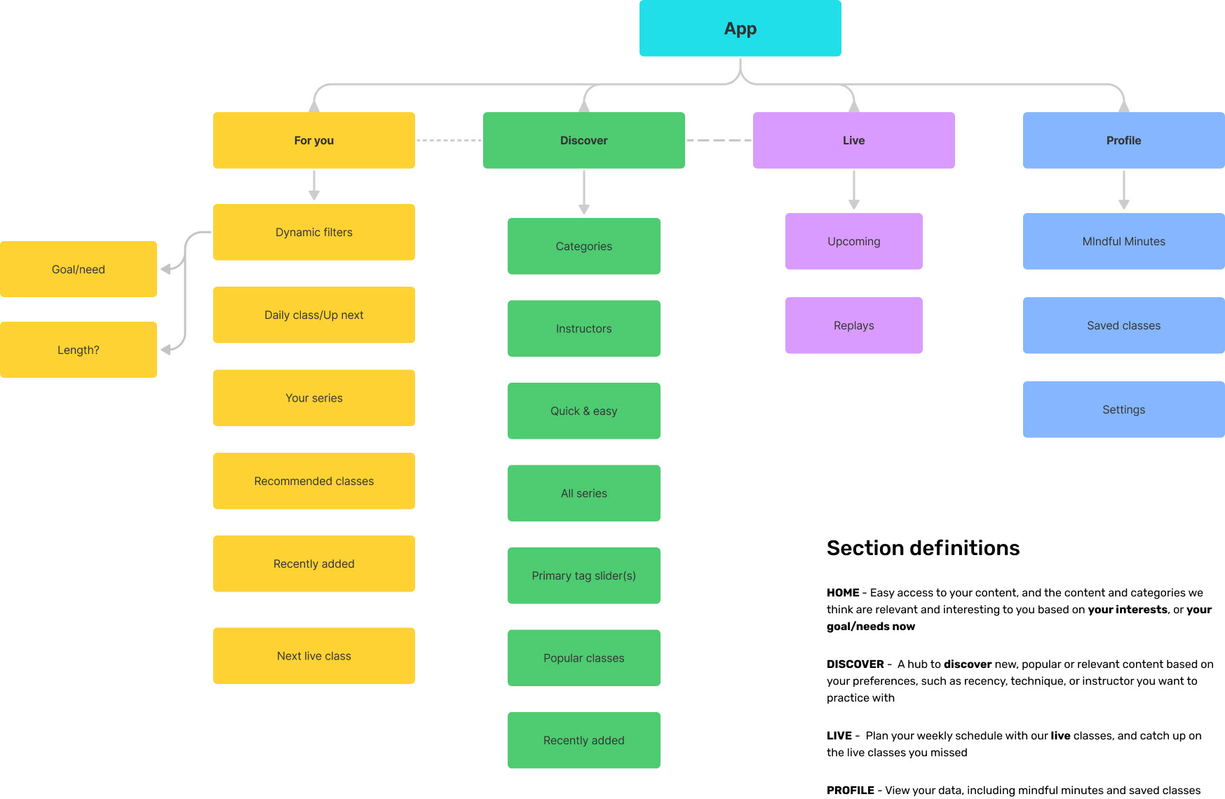
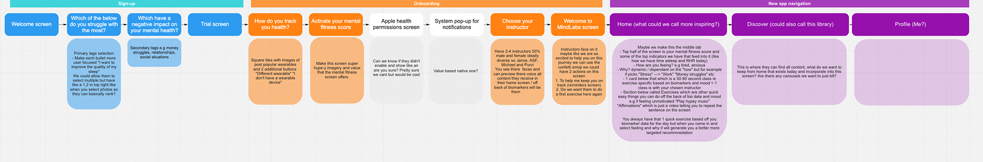
Defining the new information architecture of the app
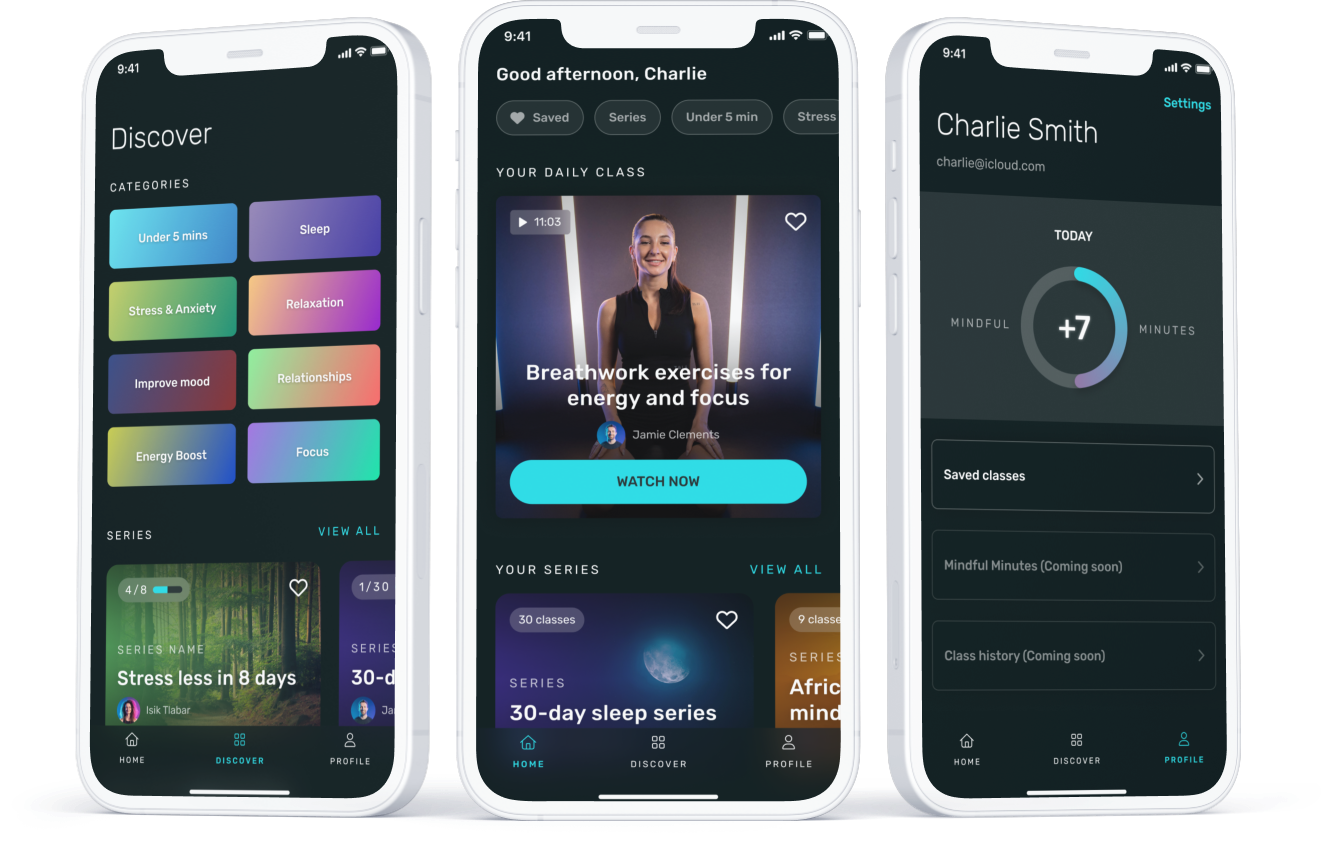
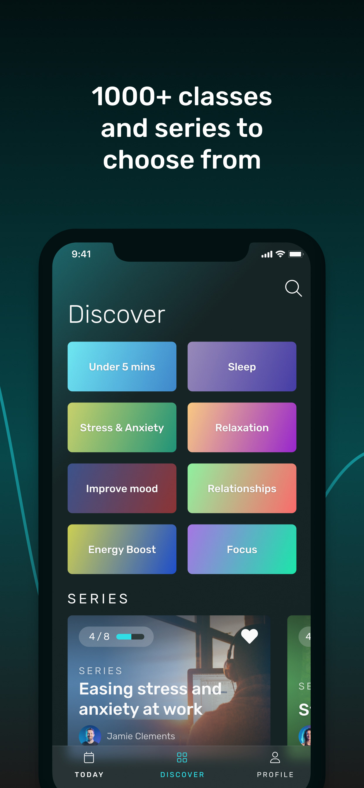
Screen design of the new Discover and Profile screens, and navigation
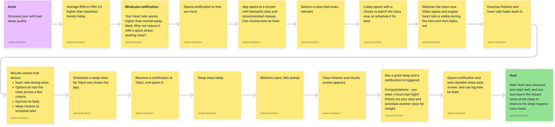
Journey map
Journey map
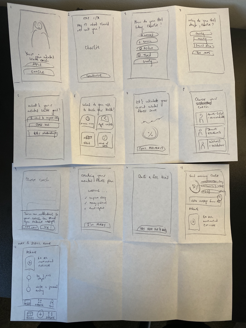
Storyboard sketch (from our talented CEO)
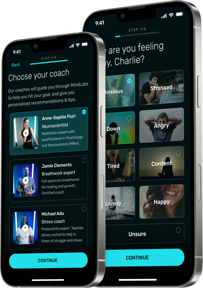
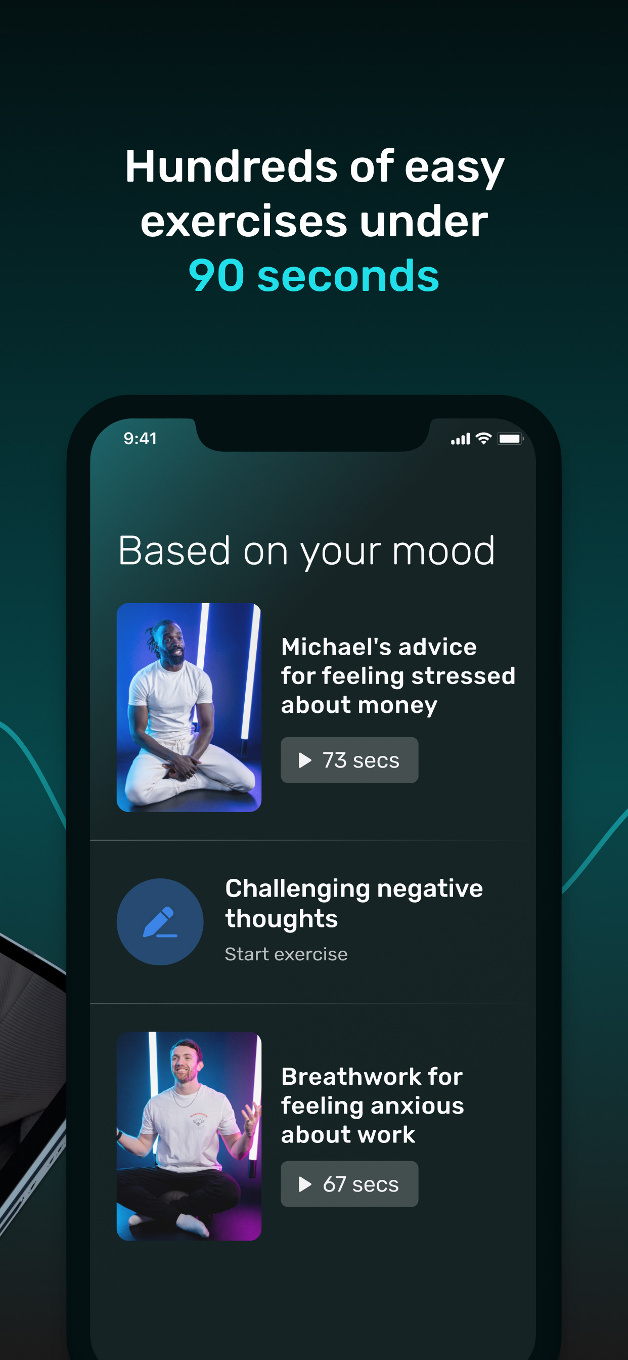
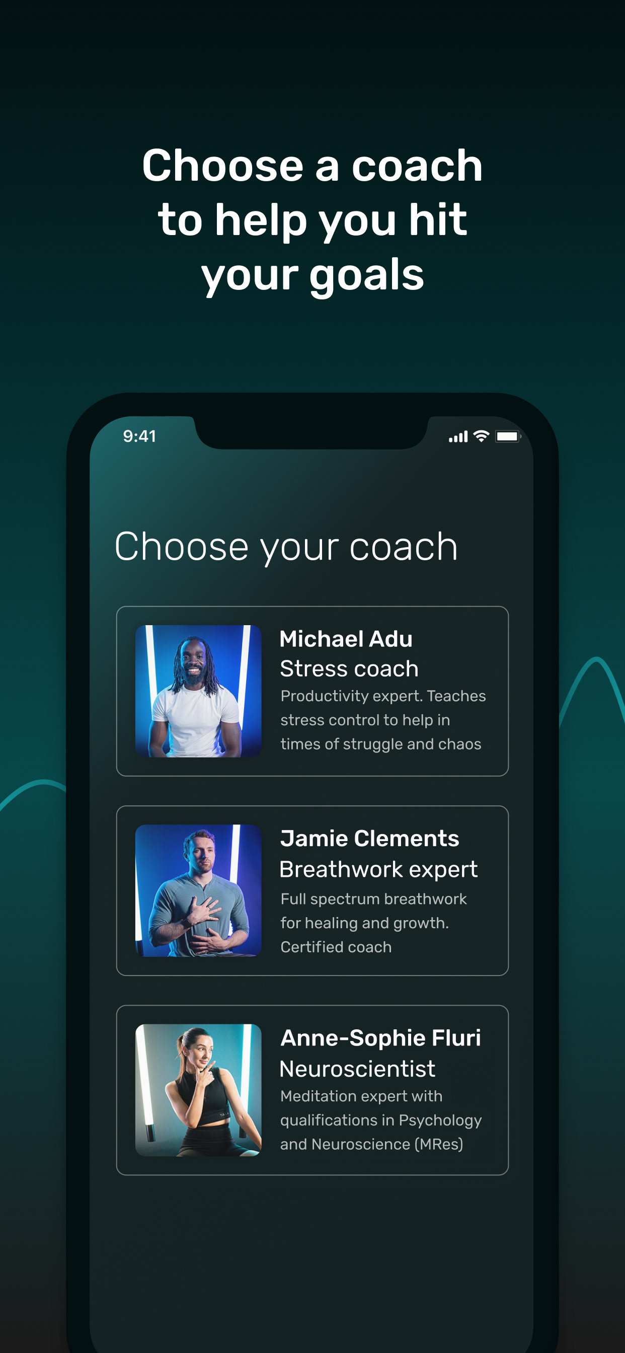
Screen design for new onboarding steps to customise how you feel and choose a coach
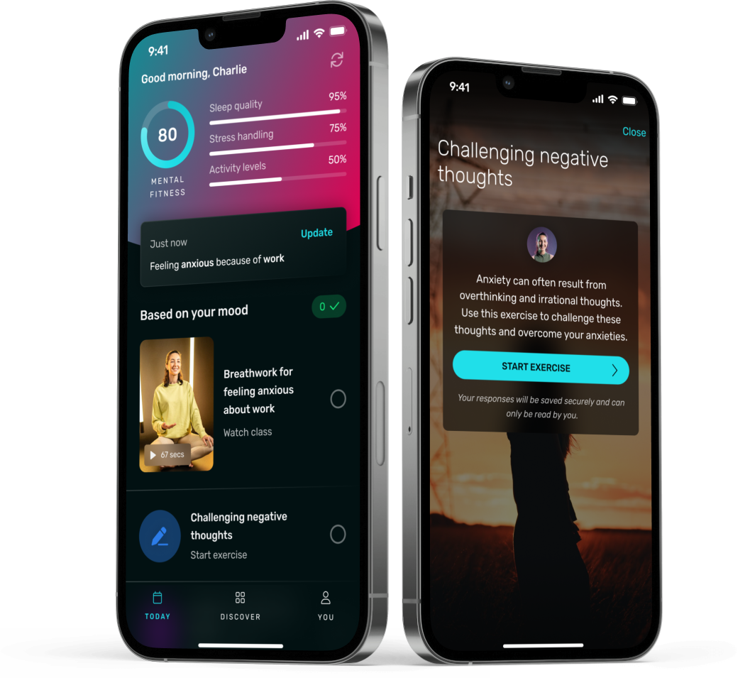
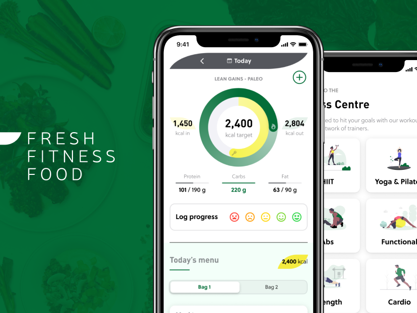
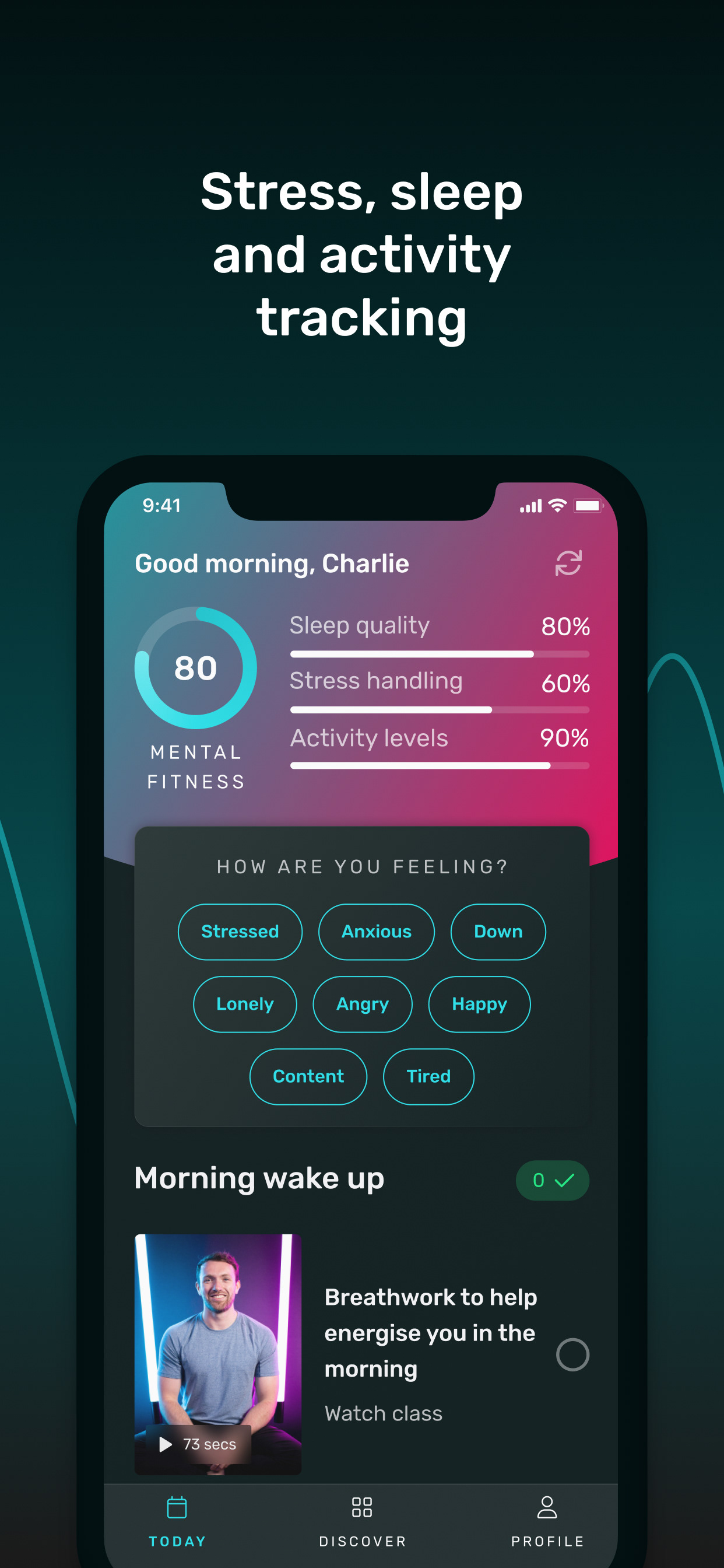
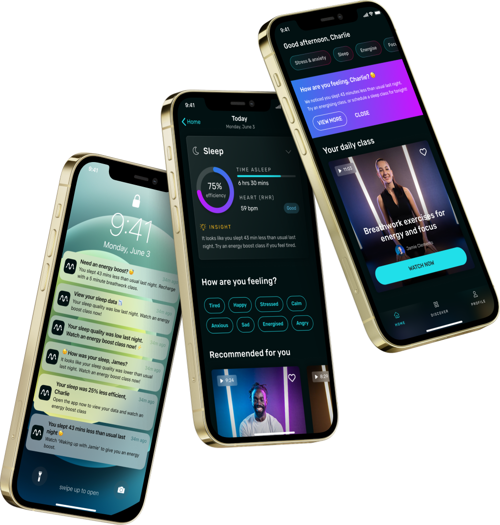
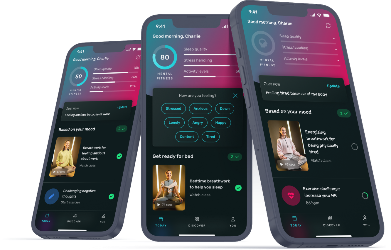
Screen design for new home screen ("Today") and CBT exercises
Screen design for various states of "Today"